Telling a story with survey data
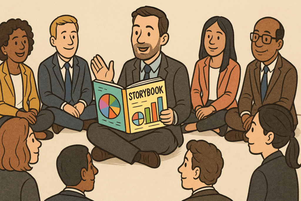
If you’ve collected and analyzed survey data, the most effective thing you can do with it is to tell a story. To do that, you create a presentation or white paper that delivers the data in a way that people can follow and understand and most importantly, shows the significance of the data.
The prerequisite, of course is to design the survey and complete the analysis as insightfully as possible, as I explained in yesterday’s post.
But what does it mean to tell a story with survey data?
All data stories look the same
Just as the structure of all movies is the same — even though the characters and details are different — all survey data stories are also similar in structure. Here’s what that structure looks like:
- Here’s who we surveyed (demographics and other characteristics).
- Here’s what they did.
- Here’s how they feel about it.
- Here’s how that differs for different subgroups.
- Here are some patterns in what they do.
- Here’s what that might mean.
For example, last year I wrote a report about our survey of business book authors (you can still download it right here). Roughly speaking, here’s the story of that report:
- We reached a diverse collection of 350 business authors and prospective authors.
- They spent money on a variety of services, with a median spending of $7,000.
- Books generated revenue from a variety of sources, including speaking, consulting and workshops, averaging $18,200 in revenue.
- Hybrid published authors spent more, but were happier with the results.
- Counting all spending and revenues, 64% of business books were profitable. On average, every dollar spent on a book returned $1.24 in revenue.
- A strong revenue strategy, hiring a ghostwriter, and engaging with a PR firm were correlated with higher profits.
- Most authors accomplished their goals, and most planned to write another book.
While that doesn’t match up bullet for bullet with my story structure, you can see all the elements: who we surveyed, what they did, how they felt, how different groups fared, and patterns in outcomes.
Telling a story with data creates influence
A lot of people who conduct surveys just publish the raw numbers. This is common for polls, for example, where speed of publication is more important than adding interpretation.
But if you have enough time to analyze the data properly, you should also invest some time in how you assemble that data to tell a story.
Why?
You can turn the data into a speech or presentation.
You can highlight interesting data points that will get cited and quoted in media.
You will become known, not just as a data collector, but as an expert in the topic. And unlike so many experts, you’ll have data to back up your perspectives.
Telling a story with data isn’t just something you tack on at the end of the project. It’s the way you turn your investment in data into visibility and influence.
Agreed. Also, I suggest such a story is more powerful if it includes, where possible (previous survey data, maybe) some reference to change over time ( a trend, perhaps, or what might come next) and some sort of application of expert experience. For instance, you are an expert on business books, so you must see related data often, so can you provide any insight into what that survey means, trend-wise or recommends for action?
How about Why?
And I agree with Bill on what’s new & trend and action steps.
Or maybe, it’s better to say, authors ought to consider these three.