When pie charts don’t total 100%
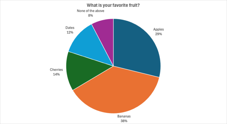
Consider the pie chart shown below, for a survey of grocery shoppers who were asked “What is your favorite fruit?” and given four choices: apples, bananas, cherries, or dates. Is something wrong here? Pie charts are supposed to add up to 100%. But the percentages here add up to 101%. Clearly the people collecting and…
