How Venn diagrams work, a tutorial for outgoing Wisconsin governor Scott Walker
Republican Scott Walker won’t be governor of Wisconsin for much longer; Democrat Tony Evers beat him in the recent election. But in the lame duck session of the Wisconsin legislature, Republicans passed bills that will limit the the powers of the incoming governor. Walker used the world’s dumbest Venn diagram to explain why the bills aren’t actually a power grab.
Here’s the chart that Walker used to explain that despite the new bills he is signing, the governor’s office has pretty-much the same power as it used to:
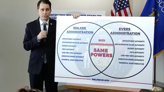
Umm, that’s not really how Venn diagrams work. You don’t just draw circles and put stuff in them. As all of us learned in third grade, the stuff in both circles go in the middle, and the stuff not in both circles goes on one side or the other. And the stuff that doesn’t belong in either circle goes on the outside.
If you read the coverage of these bills, it becomes very clear what is going on here. Walker, backed by the Republican legislature, took a whole bunch of actions including joining a lawsuit to withdraw from provisions of the Affordable Care Act and offering tax incentives to companies to keep jobs in Wisconsin. The Republicans in the legislature just wants to make sure that when Evers comes in he can’t do the same sorts of things Walker did, and can’t undo the things that Walker did already.
The laws Walker signed also include changes like limiting early voting that have nothing to do with the governor’s powers.
True, the laws do not remove the governor’s veto or appointment powers, which probably would have been contrary to the state constitution. But they remove as much as the legislature thought it could get away with.
So based on the set theory I learned in graduate school — and what we all learned in third grade — here’s what Governor Walker’s diagram should look like:
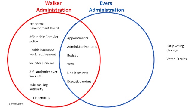
Of course, standing up next to that wouldn’t really make Walker’s point.
Graphics are (or ought to be) truth
Graphics can make points in powerful ways. There’s a whole science of data visualization dedicated to how to use them.
But people are watching. They know the difference.
So don’t be like Scott Walker. Don’t use graphics that make you look like an idiot.
Good catch, Josh. Your final sentence says it all.
These days, Venn diagrams are more commonly used facetiously; search for funny Venn diagrams. My favorite Venn diagram explains the difference between geeks, nerds, dorks, and dweebs: https://laughingsquid.com/nerd-venn-diagram-geek-dork-or-dweeb/
I’m a Wisconsinite. When I first saw the photo of Walker standing next to the Venn diagram I checked to see if this was an Onion article, or cleverly photoshopped. Nope, he really used it–and with a straight face and absolutely no sense of error.
Adding insult to injury, on the same day he stood next to this “same powers” diagram, he used a power he removed from the next governor (issuing a huge monetary package to a business that was grumbling about leaving Wisconsin). Probably not the best way to highlight this “same powers” message.