Because of this terrible chart in Georgia, people could die
Data is crucial in making decisions about reopening states. So is the visualization of that data. And the state of Georgia may have just published the most misleading and dangerous chart about virus infections ever.
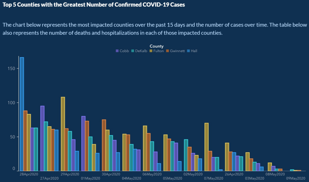
Here’s the chart. Take a close look. (You can see it bigger here.)

The vertical axis is infections. The horizontal axis is time. And things are clearly declining — the bars are getting smaller and shorter.
Except there’s a little problem. Look closely at the x-axis. I’ll blow it up for you:

Here’s a helpful tip: never show dates in any order except chronological. In the presentation of the Georgia Department of Public Health, dates go like this: April 28, 27, 29; May 1; April 30; May 4, 6, 5, 2, 7; April 26; May 3, 8, and 9. Apparently time travel is now possible in Georgia.
It gets worse. In each set of bars, the data is sorted from the county with the most infections to the county with the least. So in the first set, the bars show, in order, Hall, Gwinnett, Fulton, Cobb, and DeKalb county, but in the second set, it’s Cobb, DeKalb, Fulton, Gwinnett, and then Hall. The rainbow isn’t in the same order in each set of bars.
(Incidentally, if you asked me to take this data in Excel and make a chart that looked this way, I couldn’t do it — and I’m pretty good at Excel charts. If this happened by accident, it’s the most unusual accident in the history of charts.)
The eye uses charts like this to make comparisons. Scrambling the order of the bars makes those comparisons impossible. Sorting dates from high to low makes them fraudulent.
If you believe the impression created by this chart, you might think the virus problem in Georgia is over. You might decide that you no longer need to take precautions. And you might infect someone else, or get infected yourself, as a result. So yes, this chart is dangerous to people’s health.
If you can’t trust the data, you can’t trust Georgia
This isn’t an isolated case. As the Washington Post writes:
The governor’s office apologized for what state Rep. Scott Holcomb, an Atlanta Democrat, properly called a “cuckoo” presentation of data. But as the Atlanta Journal-Constitution noted, it was the third such “error” in as many weeks involving sloppy counting of cases, deaths and other measures tracking covid-19. Another official state chart continues to show cases dropping dramatically over 14 days, with an asterisk explaining that “confirmed cases over the last 14 days may not be accounted for due to illnesses yet to be reported or test results may still be pending.”
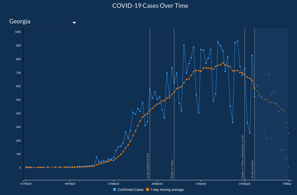
As I write this, here’s what the Georgia Department of Health displays on its site regarding cases of COVID-19 in Georgia:

The orange “7-day moving average” is clearly declining. But in the shaded area at the right, the data is described as “preliminary” and the chart includes this legend:
* 14-day window – Confirmed cases over the last 14 days may not be accounted for due to illnesses yet to be reported or test results may still be pending.
Note – Data during the reporting period may be incomplete due to the lag in time between when the case was tested and/or reported and submitted to the Georgia DPH for reporting purposes. This delay can vary depending on the testing facility and/or jurisdiction.
Is it safe to go out in Georgia? Maybe. But if you can’t trust the government’s data and presentation, what makes you sure you can trust their decisions?
That chart is appalling. If I were still teaching my dataviz class, I would show it as an example of what not to do.
Disgraceful.
I can just see this happening in Pennsylvania where the Governor and the Secretary of Health are being bombarded with requests for their resignations even though they’ve been correct most of the time.
Yeah, same for Florida, they just “reassigned” the woman who developed a most consumable dashboard relaying Florida information on COVID-19 infections. So now, what will you get in Florida? Not much…
Obviously not an accident or sloppy work. Deliberately misleading. Lying for money…. people should lose their jobs, prosecution to follow. But that’s not going to happen, not in Georgia or Florida.
Can’t you just picture the meeting where this chart was dreamed up? Some poor slob (now “reassigned”) says “Well, we have to report the numbers honestly!” And some guy at the other end of the table, twirling the ends of his mustache in his fingers, says, “Not necessarily ….”
It’s really hard for me to believe that there are people with this little amount of integrity in public service.
I teaching a two-day data-visualization class and I’m including this great post—with attribution, of course.