The worst slides in Mary Meeker’s trends report
Mary Meeker’s annual Internet Trends Report for Kleiner Perkins is a comprehensive and provocative collection of data about technology change. It’s also the most cluttered, visually jumbled 213-slide pileup in the history of PowerPoint. Reading this deck is like walking through a construction site in which the Hell’s Angels are putting on three simultaneous Cirque de Soleil shows during a Green Day concert. In a snowstorm.
While it’s arguable whether there is a unifying intellectual concept here, one thing is completely clear: there is no unifying design concept (unless you count the wordy, telegraphic headings on each slide).
Just as you can learn from Meeker’s trend insights, you can also learn from her design disasters. As you look at these slides, ask yourself two questions:
- In a quick glance, what main idea jumps out from the slide?
- If I study the slide further, does it reveal more information?
In too many cases here, the answer to the first question is “Gee, I dunno,” and the answer to the second is “Ouch, I am getting a headache.”
What the heck is going on?
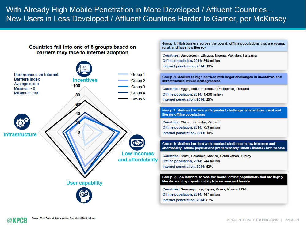
The dreamcatcher on the left is pretty. Especially with five shades of blue matching the crammed text boxes plotted against four undefined metrics with obscure icons.
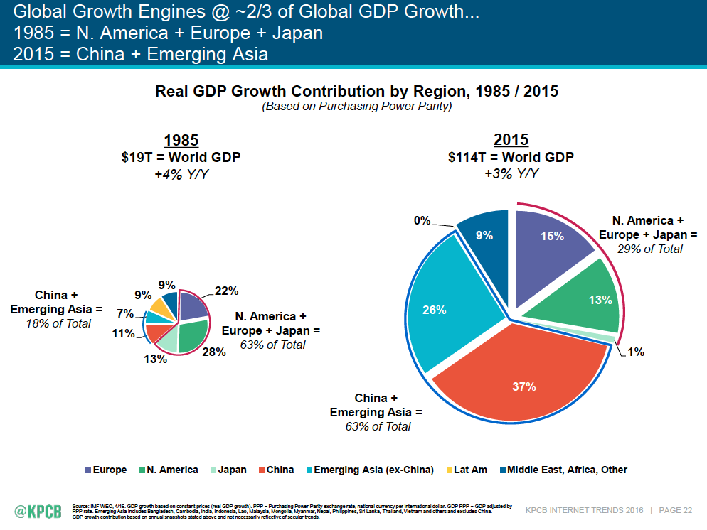
That “0%” pointing to nothing on the pie on the right . . . that’s deep, man.
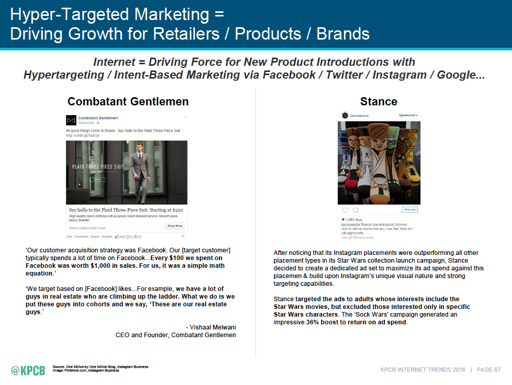
The number of words on a slide should be about 15. This is in the hundreds. It’s a document, not a slide.
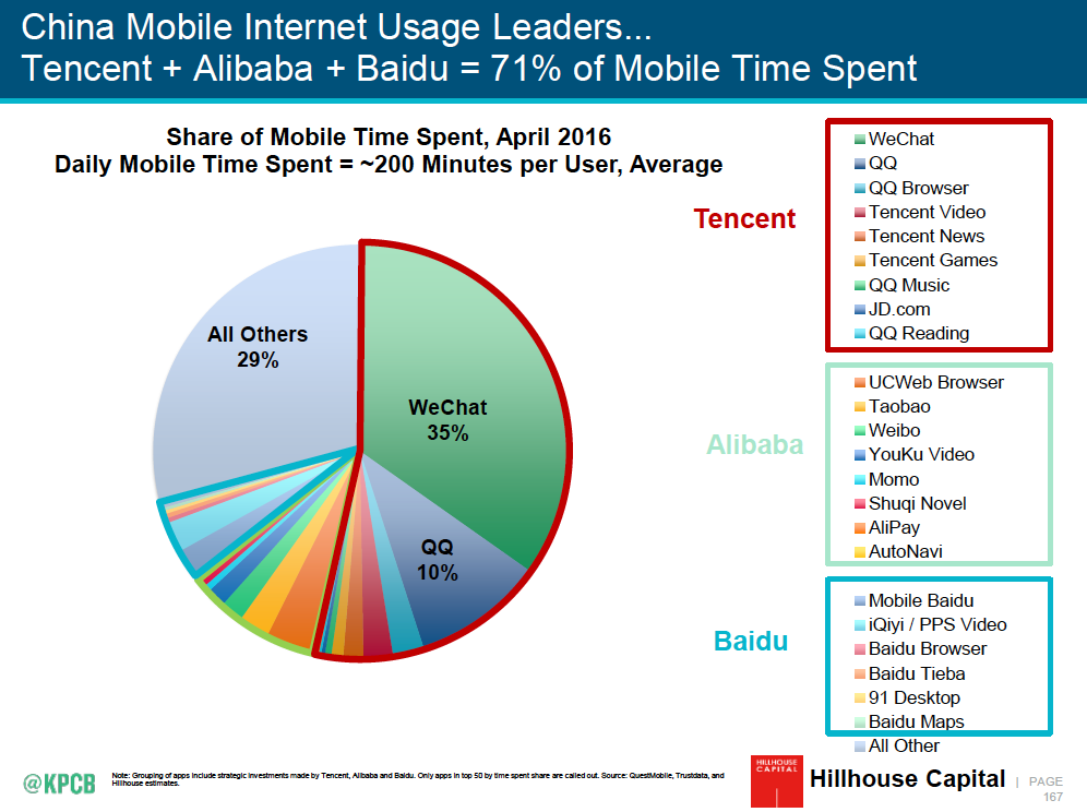
It’s not how big the slice is, it’s how you color it
Remember spin art? I think the rule here is, so long as you use bright, saturated colors, you can make the slices as skinny as you want. “Just a sliver, please, QQ Reading, I’m on a diet.”
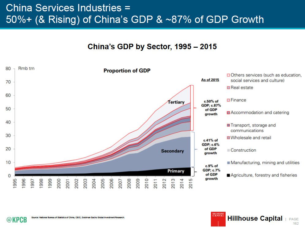
I think this is a photo of a tragic and bloody accident at a ski area. Why use colored slivers when you can use shades of grey with red outlines?
When the starting point is arbitrary, the conclusion is, too
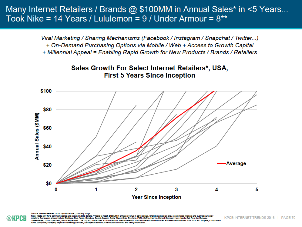
This “broken umbrella”-style slide reveals data that is complete bullshit. First, once you use “Select Internet Retailers” without telling us how you selected them, you’ve skewed the sample. Second, starting points are arbitrary — what if the retailer was in stealth mode for two years before it “launched”? And finally, what can you learn from a whole bunch of lines, some of which are incomplete?
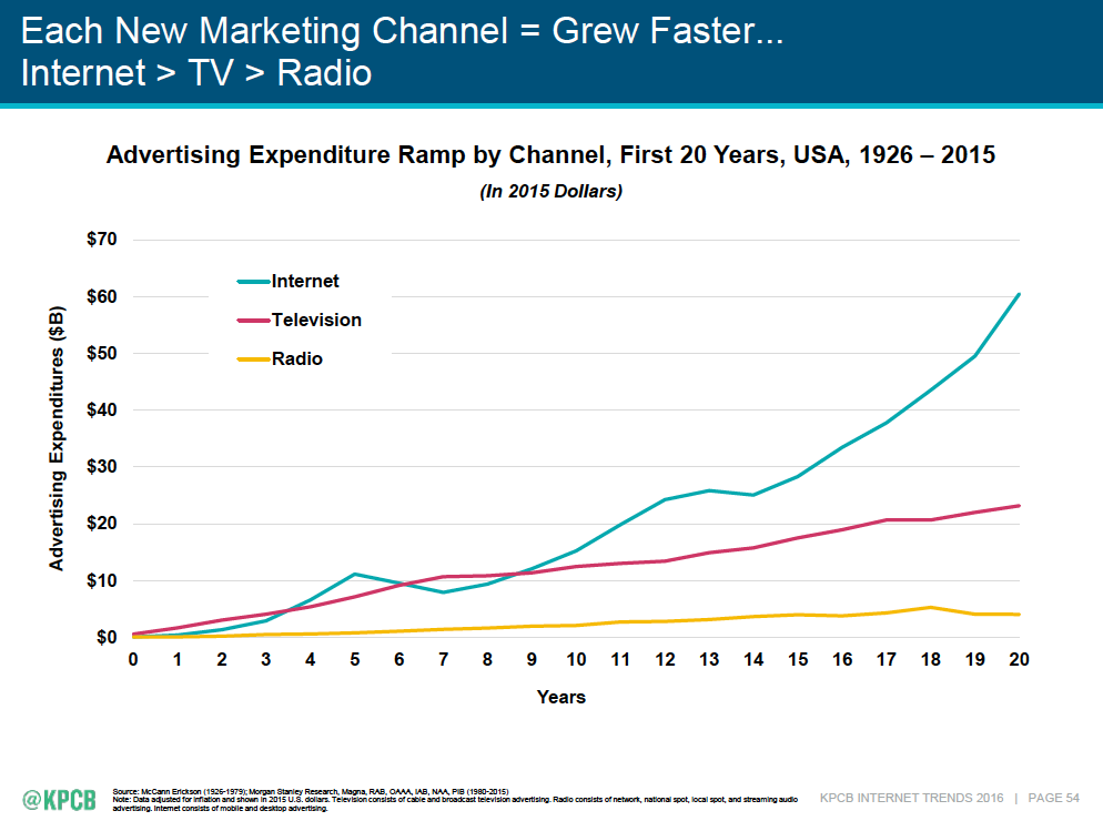
Clearer presentation, but same problem — a media channel can take years after invention to “launch,” so the arbitrary starting points completely queer the data conclusions.
She comes in colors everywhere
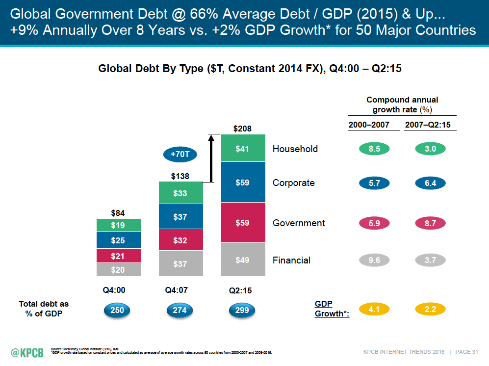
These ovals are reminding me of something in my youth . . . that’s it, Trivial Pursuit! Except here, the green ovals are household debt, the blue are corporate debt . . . except for that +70T and the ones at the bottom, which aren’t corporate debt, they’re something else, and . . . well, anyway, they’re all debt except the yellow ones, which are GDP, because yellow is the sunny color of global growth. Got it.
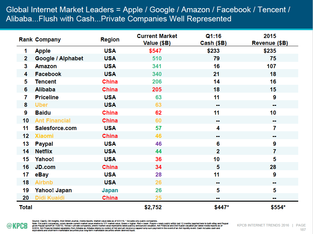
So in this slide, yellow means private companies, because yellow is hard to read and so are private company valuations. Red means Red China, but in the third column it also means declining market values for public companies because red is like a stop light. Purple means I needed another color because the slide wasn’t colorful enough.
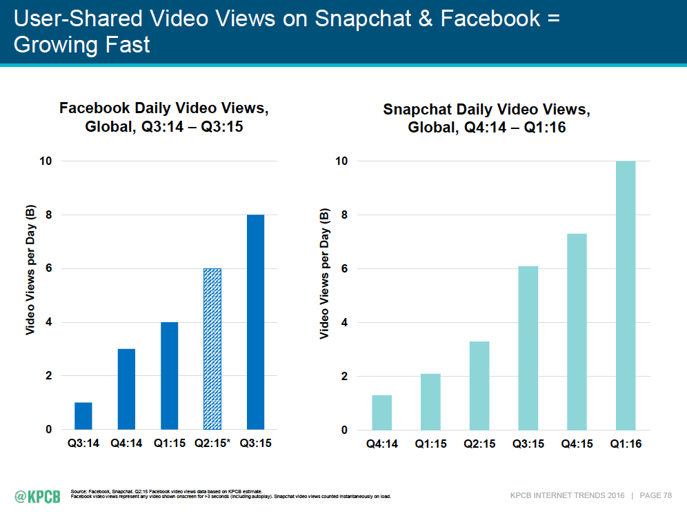
Plaid data? That’s stylin’!
The Chinese Zodiac was right . . . I can tell your fortune based on when you were born
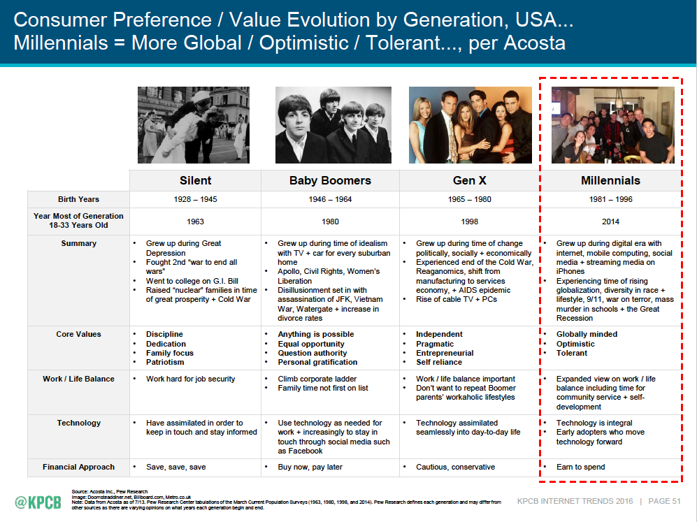
Since I’m a Baby Boomer, that means family time is not first on my list. Don’t tell my wife or kids, please. And Millennials are globally minded, except the poor ones working in McDonald’s and the trust fund babies, but we won’t count them.
Cloudy graphics
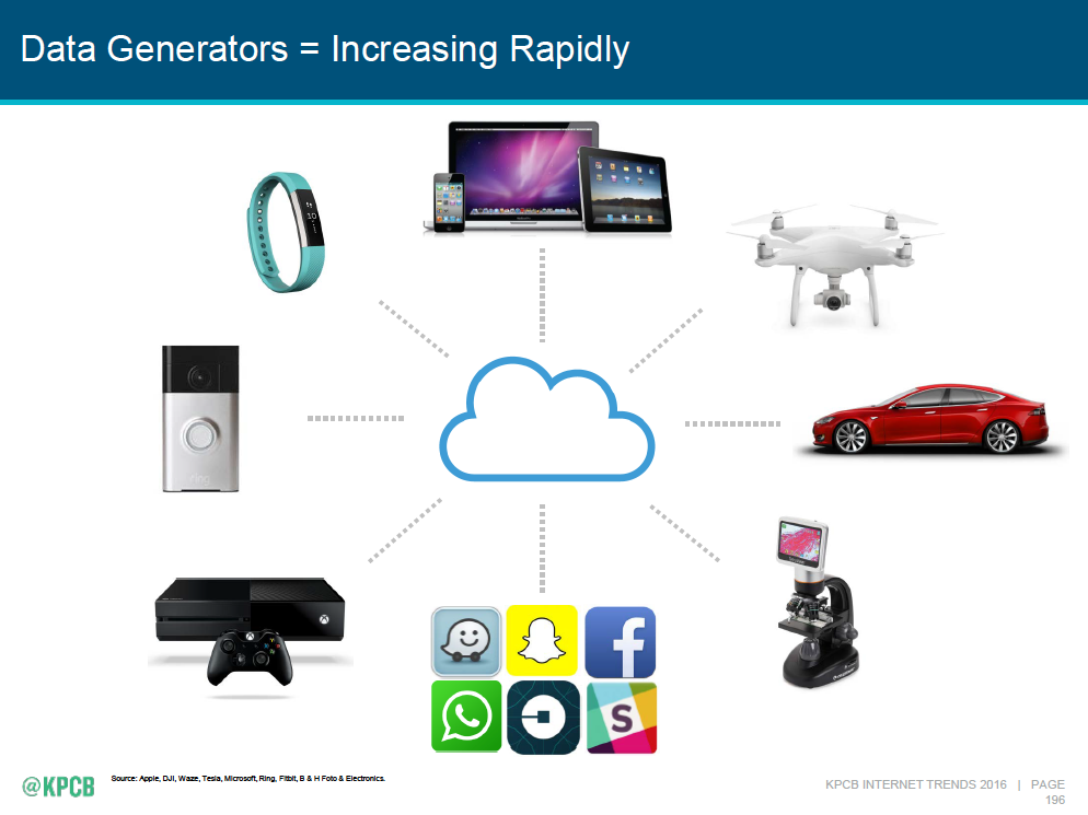
How about a rest from all those words. Let’s create clutter just with pictures. We’ll put a flat abstract cloud icon, flat app buttons, and realistic photos together in one slide, and then add some dotted lines that mean “data.” Got it.
And I’ll leave you with this
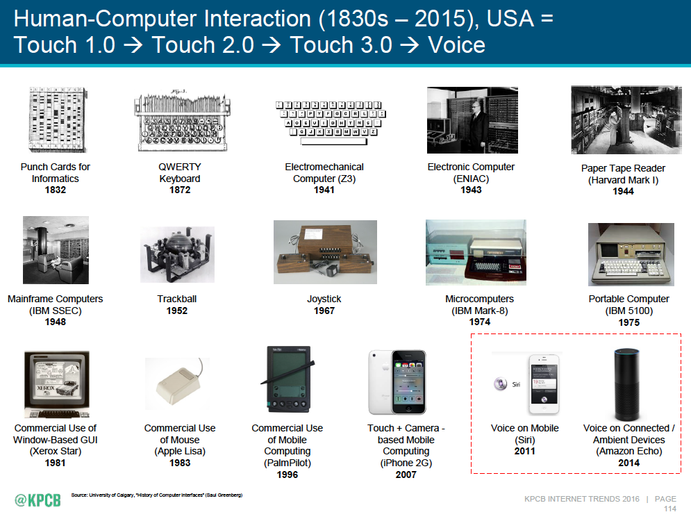
The only slide in the whole deck that made me say “Wow, that’s actually beautiful.”
Loved today’s post, Josh, especially since it took me 2+ hrs to wade through Meeker’s slidedeck yesterday.
Great info in her Report? Of course. Dense, jangled and all over the place? Duh!
And the last slide you highlighted? Yes, I liked it too. Still … it’s WAY too busy with WAY too much text on it, aka, try reading that from the back of a 1,000-person auditorium. LOL
Keep up the good work.
David
This post made my morning. Thanks Josh!
What’s amazing to me is how many “keynote” speakers I see on the conference circuit who use slides just like these…unreadable train wrecks with good points/ideas buried in the rubble.
My Iron Imperative is “You must treat the reader’s time as more valuable than your own.” The speech equivalent is “You must treat the audience member’s attention as more valuable than you own.” That means you must spend the time to improve your slides, rather than making the audience say “huh?”
I think I have a headache. What slide # is the preferred pain killer by generation on?
Time and again speakers forget that after the 5th slide, most people are looking at their phone and checking email.
A great post, Josh. The thing that makes me crazy is that this is Mary Meeker! Do you know how many graphic artists would die for the chance to make her slides look fabulous? I don’t get why she doesn’t have an intern to help. To me, the worst mistake is how awful the headlines are. If you have an unclear slide, you make up for it by netting it out in the headlines.
Basically, Mary Meeker’s slides are a good first draft. They need a good hard edit and a designer’s attention. If you publish your first draft, no matter how brilliant you are, this is what you get.
I couldn’t agree more. Many people let status interfere with accepting feedback.
She’s either unwilling or unable to accept feedback. Slides like these serve as fodder for those who create monstrosities. If it’s good enough for her…
In a word, yes. Sure, it’s rife with interesting info, but I can’t imagine trying to decipher these dense slides in the audience. Great post, Josh.
I had a boss who often told clients “If I had more time, I’d make it shorter.” We absolutely need to build in that time and get someone to look at our materials with a critical eye–early in the process.
This presentation is a horror show. I hope the presenter will take your suggestions and improve her next delivery.
Great post Josh! If there was enough time, it would be useful to go through all 213 slides to pick out the ones that are unnecessary or tell us things we already know. Let’s see. 213 slides x 1 min = 3.5 hrs. Never mind!
I hardly looked at the graphs. I was too offended by the Bullshit-laden, non-sentence slide titles.
Seriously, ever since transitioning into the marketing world from journalism, the infatuation with PPT “decks” continues to baffle me. There has to be a better way to present a report like this.
Reminds me of how people bashed the NSA carnivore slides in the Snowden affair– but sometimes important information doesn’t come in a pretty package. In fact, the prettier the package, the more likelihood of bullshit. Here are the counter arguments as to why these slides don’t suck. 1) Meeker’s slides are deliberately authentic. They are supposed to look like they came directly from her brain– without bullshit, as it were. Warren Buffett’s annual letters have design at all– and they are also widely scrutinized. 2) Meeker’s slides are essentially meant to be read– so she gets away with putting more words on a slide.
At the end of the day, every year everyone pays attention to these slides — so why fix what isn’t broken?
Interesting perspective, Andrew. I don’t agree, though. Good design doesn’t make content bullshit, and poor, unvarnished design doesn’t make it truth.
Much of Meeker’s content is ripped off directly from the original sources, which means it’s a bunch of stuff mixed up together. The jumble of designs reflects an incoherent jumble of ideas. Rationalizing both the ideas and the design would improve things.
I prefer a lot of what I consume, whether food or information, cooked a bit, rather than raw.
totally agree – arrogance at it’s height with the only person left standing would be the presenter wondering why everyone left
What if she does have an intern, and what if she does have someone with whom she reviews the slide for clarity? What does that say other than it is really hard to write clearly, especially when conveying a lot of (supposedly) important information? We are conditioned to dumbed-down, bullet-pointed, meaningless slides, and this is the other extreme. One way that this could be improved is breaking down the information even more, and then having a paragraph or two to really explain the key points. That assumes people will take the time to read. How does a 550-slide deck sound to you?
Thanks Josh.
Meeker’s slides are horrible, horrible, horrible. The content is not original but purloyned from others. The analysis is missing-in-action. The only good it does is that it provides links to original research sources.
It is ironic is that Meeker is a partner at KPCB, a marquee VC. Imagine turning up in front of their partners to give a talk about your startup with your standard 10 slides looking like Meekers content. They’ll show you the door.
These are standard Investment Banking slide decks. They are mostly meant to be printed and poured over rather than displayed on a projector. All credits to MM for being consistent over the years.
If they are standard investment banking slides then make them available to investment bankers only not to the whole world. If Meeker wants the rest of the world to be informed then produce a short summary deck.
Rishi, standard banking decks or not, think how much more powerful, effective and clear they could be with tight editing and high level design? It always amazes me that Wall Street bankers and global investors will spend millions on their dealmaking and not be more effective to save a couple of thousand dollars for great design.
It might be useful for these gurus to ask themselves how would Steve Jobs approach a presentation?
Will we see the day, and what might it be like when connectivity
becomes more pervasive than consciousness itself?
A pseudo singularity of oblivion….
Here is another take on these slides from Nancy Duarte of Slideology fame. She dissects errors in many of the same slides you did and zeroed in on pie chart misuse.
https://www.linkedin.com/pulse/3-tweaks-meekers-slides-nancy-duarte