There are viral disease models. And then there is presidential advisor Kevin Hassett punching random buttons on Excel.
In a chart posted by the White House Council of Economic Advisors, one curve projects no more COVID-19 deaths after mid-May. The curve, based on data from presidential advisor Kevin Hassett, is malpractice — it’s not even good enough to be wrong. Let’s take a quick look at what models are, how they succeed or fail, and why the CEA’s curve is bullshit.
A mathematical or statistical model is an idealized mathematical description of a real-world system. I made dozens of such models as an analyst at Forrester Research.
A model attempts to make sense of the world by describing it in statistical terms. Every model has inputs — variables — that determine the outputs — predictions about the world. Some economic models have hundreds of variables. Other simple models have only a few.
Models are always wrong (or, strictly speaking, not completely accurate). The reason is that the real world is noisy with many variables that can’t easily be predicted or incorporated into a mathematical system. But wrong doesn’t mean useless. A model tells you things about reality. To the extent that a prediction is wrong, you can attempt to determine why and how it is wrong. As the statistician George Box said, “All models are wrong, but some are useful.”
For example, a model could be off because the initial variables are inaccurate, because the mathematical relationship doesn’t actually apply, because there are other confounding factors that the model doesn’t account for, or because the data you are using for either inputs or outputs has inaccuracies in it.
Let’s take a look at the models so many people are using to project infection rates and deaths from COVID-19. In their simplest form, they use two basic inputs:
- R0, the basic reproduction number, is the number of individuals that an infected person infects with the virus. If R0 is 2, then every individual infects two others, and you have a runaway virus. If R0 is 0.5, the virus will die out as fewer and fewer people get infected. R0 greater than one means a virus that will continue to spread (barring the factors I describe below).
- The death rate is the proportion of infected people who die.
Ideally, you punch R0 and the death rate into a mathematical formula and get an infection curve.
The virus that causes COVID-19 appears to have an R0 of about 2.63. It’s very infectious. This is why, in the absence of measures to halt the spread, the growth is exponential. (Typically, the term “exponential” is hyperbole, but in this case, the spread is literally exponential, doubling every few days.)
Two types of things modify the effective rate of spread.
One are actions we take, such as staying indoors, washing our hands, maintaining social distance, wearing masks, and avoiding crowds. This is one main reason the spread is slowing down. Contact tracing — finding people who may have been exposed to those known to be infected and quarantining them — is another way to slow the spread.
The second thing that affects the spread is herd immunity. If enough people in a given place are infected and recover, then the virus has fewer people to potentially infect. This slows the spread down.
You can also improve the death rate. For example, the availability of ventilators and ICU beds, how early in the disease’s course people are treated, and drugs like remdesivir that may be effective treatments will all potentially reduce the death rate.
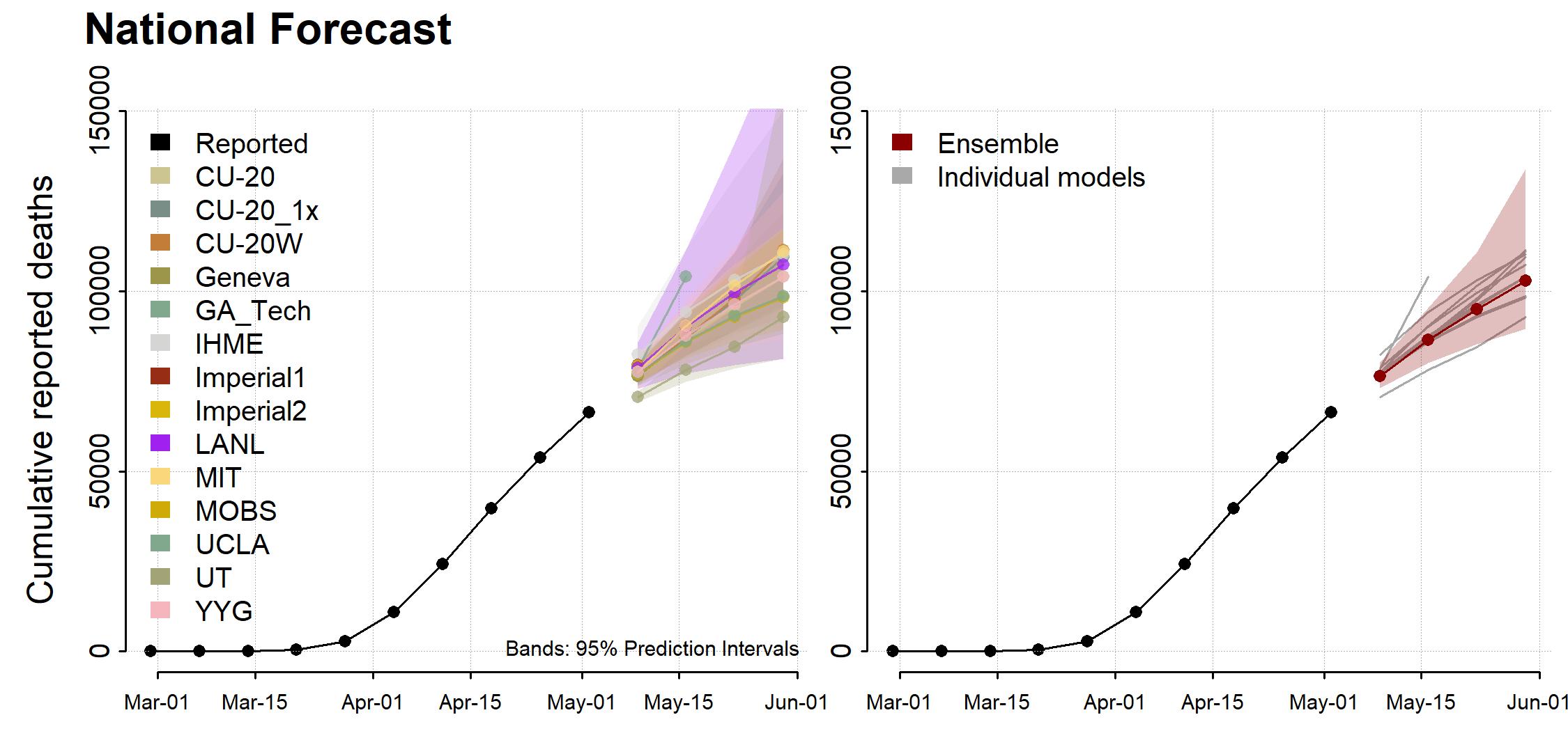
Put this all together and you get projections like these, from the CDC.
Why the results of the models are so variable
A few weeks ago, we heard projections that the total number of deaths from COVID-19 would be about 65,000. Now it’s north of 100,000. Why were the models so far off?
The answer, basically, is that R0 is really hard to measure, and small variations make a huge difference.
Start with the death rate. If 2 million people are infected and the death rate is 1%, then 20,000 people will die. If the death rate is 0.9%, then 18,000 people will die. The relationships is linear — small variations in the death rate cause proportional variations in the number of deaths.
R0 is more problematic. If R0 is 2.0, infections might double every 4 days, or go up by a factor of 180 in a month. If R0 is 2.1, infections go up by a factor of 260. If it is 1.9, they go up by only 123. So small variations in R0 create huge shifts in the number of infections. Exponentials are like that.
This is why the models have been so poor at estimating what’s going on: there’s no easy way to measure R0 and account for all the confounding factors.
Still, although the models are wrong, they are useful. Reducing contacts slows the spread. And bending the curve, even a little, makes a big difference.
White House advisor Kevin Hassett doesn’t have a model. He has Excel.
There are models. And then there is bullshit.
Here’s a chart that the White House Council of Economic Advisors tweeted on Tuesday.
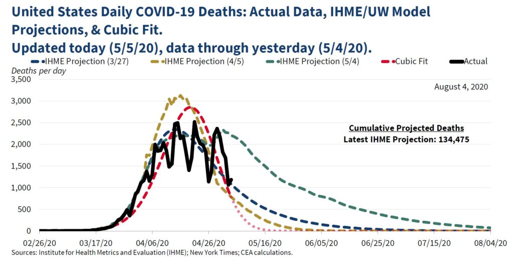
The three dashed lines are projections. The red dotted line, labelled “Cubic Fit,” is the one that shocked people, since it shows infections dropping to zero in May.
Where did that line come from?
It came from Kevin Hassett, former chair of the CEA and an unpaid advisor to President Trump. And he made it by punching the existing data into Excel and fitting a cubic curve — basically, a smooth line — to the data. A cubic fit will smooth out the bumps in a noisy set of data.
Technically, a cubic fit is an equation that looks like this:
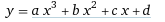
Here x is time, y is the number of deaths, and a, b, and c are the numbers that Excel’s algorithm determines will create the best-fitting curve.
This does indeed generate a prediction based on past data. But it’s complete bullshit. It is not a model, because there is no reason to believe the deaths follow a cubic curve. It completely ignores the exponential growth that characterizes viral infections.
According to The New York Times:
Kevin Hassett, the former council chairman who left the White House last year, only to return as an unpaid adviser to President Trump during the pandemic, said in an interview on Wednesday that the chart in question was not a forecast of deaths and never meant to be read as one.
It is not even a model of the virus, Mr. Hassett said. Rather, the chart was intended to show a simple mathematical formula, logged in a popular spreadsheet program, that produces a graph that roughly aligns with the forecast model of daily virus deaths produced by a team at the Institute for Health Metrics and Evaluation at the University of Washington. It looks like a smooth curve, peaking near the end of April and falling off quickly this month. . . . Mr. Hassett said the dots at the end — the ones showing deaths trailing off to near zero by May 16 — were not a prediction and were never understood by anyone in the White House to be one.
If you want to monkey around with spreadsheets to smooth out the bumps, good for you. But when the White House Council of Economic Advisors publishes your numbers in the same chart with a bunch of actual projections, that’s malpractice.
Here’s what an actual wizard at statistical projections, Tom Webster, says about how people are abusing statistics in this fraught moment:
Watching people cherry-pick a stat to support the belief they already held in the absence of data is like watching someone grab a platypus in the dark and argue that it’s a duck. It’s not a duck. In the comments of nearly every Facebook post I’ve seen about ending the lockdown, somebody makes this comment: “Well, statistics can be made to show anything.” My dog-eared copy of Strunk & White tells me to Eschew Passive Language, so let’s just put the subject of that sentence back in, shall we? “YOU make statistics show anything YOU want to show.” Statistics are not misleading. Statistics simply are. People mislead.
The models are flawed, but they are useful. Cubic curve-fitting, on the other hand, is just adding noise to an echo chamber already rife with questionable information.
So let’s keep the bullshit out of the official channels, shall we?
Thank you for your analysis, your crystal clear writing and your ability to explain complicated, confusing and esoteric (to many of us) subjects in a comprehensible manner. If only I could force people to read your blogs, the world would be a better place. As it is, you are a positive force in that direction. Thanks again.
Logical fallacies seem to be ruling the day for a too-broad swath of the US population. >:-(
Used to think it was ignorance, but it sure is looking like people just want to justify their priors with anything that fits that viewpoint. Unfortunately, there are charlatans out there willing to provide them the fodder they seek.
Another ultracrepidarian associated with an administration headed by the ne plus ultracrepidarian.
Lowering the curve (taking action to reduce the speed of the spread) is largely about preventing the medical system from being overwhelmed, and allowing time to build capacity (bed, ventilators, PPE, labor), and possibly improved treatments, and/or a vaccine.
Herd immunity is estimated to be from 50% to 75% or higher of the population. At R0=2.63, that would be 62% of the population.
Today we are at only 1.25M who have contracted COVID-19 (less than 0.4% of the US population).
If we held down new cases to the 15K a day current rate, that would be over 37 years to get to that 62%.
That is a lot of time to buy!
Clearly, that is not humanely sustainable.
We hope there will be treatments that drastically reduce the death rate, but we cannot count on that.
Right now, the lowest (credible) estimated mortality rate is in the 1% range (Dr Fauci https://www.c-span.org/video/?c4860450/user-clip-dr-anthony-fauci-addresses-covid-19-mortality-rate ) and may actually be tracking closer to 6% of cases (https://coronavirus.jhu.edu/data/mortality).
However, without widespread testing, these may be over-estimating the rate, as the actual number of people infected may be much higher thant the 1.25M today.
Likewise, with certain jurisdictions experiencing an “excess of deaths” over historical averages, not explained by the official COVID-19 death counts, we may also be under-counting deaths.
Also, we are assuming immunity from the disease after one survives it, but we don’t know if that is even the case, and, if it is, how long that lasts.
Nonetheless, say we could achieve a mortality rate closer to 0.5% – at 62% of the population that is still 1M deaths. An even more modest estimate of 0.25% would be 500K deaths.
That is well beyond the numbers we are being told by this WH administration.
Based on this, completely “reopening” doesn’t seem right either, as, despite the sentiment of some, there is a real untimely loss with those deaths (https://www.economist.com/graphic-detail/2020/05/02/would-most-covid-19-victims-have-died-soon-without-the-virus ).
Most of our states have (so far, thankfully) under-used their hospital resource capacity for dealing with COVID-19 patients ( https://covid19.healthdata.org/united-states-of-america ).
They should follow the guidelines issued by the White House for a phased approach (not all the states “re-opening” are, unfortunately).
But, they also should aim to keep hospital resource use to under 50% of capacity, as the virus has a potential to double the cases in a matter of days. They need that overhead buffer.
This should be managed at the lowest jurisdictional level where a population is within a hospital’s (or cluster of hospitals’) service area – in many cases that will be the city or county.
They each can work the numbers backwards to estimate how many new cases a day that threshold would be.
As capacity, treatment, and/or a vaccine come available, they can be more liberal with the level of opening.
In parallel to continuing to build capacity, testing needs to be ramped up – it is critical to zeroing in on what the true R0 and mortality rates are. We realistically need multiples of 300M units – to allow us to pervasively test on an ongoing basis for the foreseeable future.
Contract tracing is useful for finding and isolating infected people – but, is that practical at the current 15K per day? Maybe it is all we have until we can scale testing.
As to defining the specific guidelines for opening in phases, there is a lot more room for debate – we will probably be learning as we go.
Like most things in life, there is complexity around these big issues and too many exploit that with “simple” answers. No matter what, we don’t have great choices.
So here we stand divided more than we need to be, with some recklessly all in on opening and others stubbornly and disastrously all in on lock-down.
Sadly, this has become another avenue to signal which team one is on – forget the facts or reasonable discussion.
“All models are wrong, some are useful”. Supposedly said by the venerable statician David Cox, I’ll be glad if someone has a definite reference.