The missing feature in every writing and editing tool

I write and edit about 90% of the time. I use writing tools all day long. I’ve probably written 10 million words so far. And one feature of every writing and editing tool has interfered with my productivity for decades.
Why do we do nearly all of our writing in the bottom 10% of the screen?
To be clear, this is not a critique of Microsoft Word or Google Docs. It’s the same in every place I write, including WordPress, Medium, and LinkedIn. I don’t use Substack, but I bet it’s the same there — and anywhere else you write more than a few paragraphs.
How the problem looks
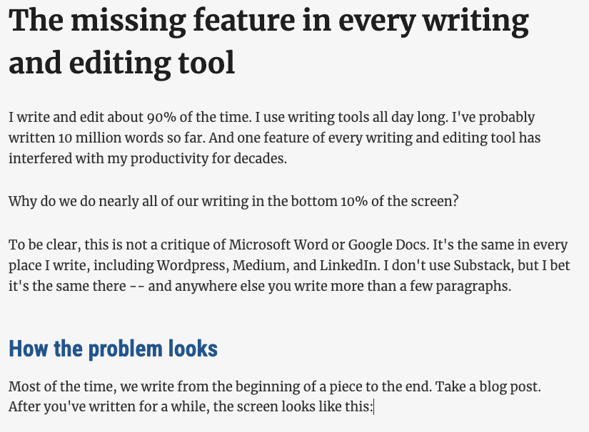
Most of the time, we write from the beginning of a piece to the end. Take a blog post. After you’ve written for a while, the screen looks like this:

As a result, you spend much your time looking down at the bottom few lines of the screen, where the flashing insertion point is. If you’re like me, you may sometimes go back and forth on the last sentence or two, editing as you go, before moving on. But that still means that you’re spending most of your time looking at the bottom few lines of text.
Ergonomically, even if you’ve correctly set up your monitor or laptop so that the center of the screen is right in front of your eyeballs, your neck will still be bent over as you peer at the bottom of the screen. It’s just cramped down there.
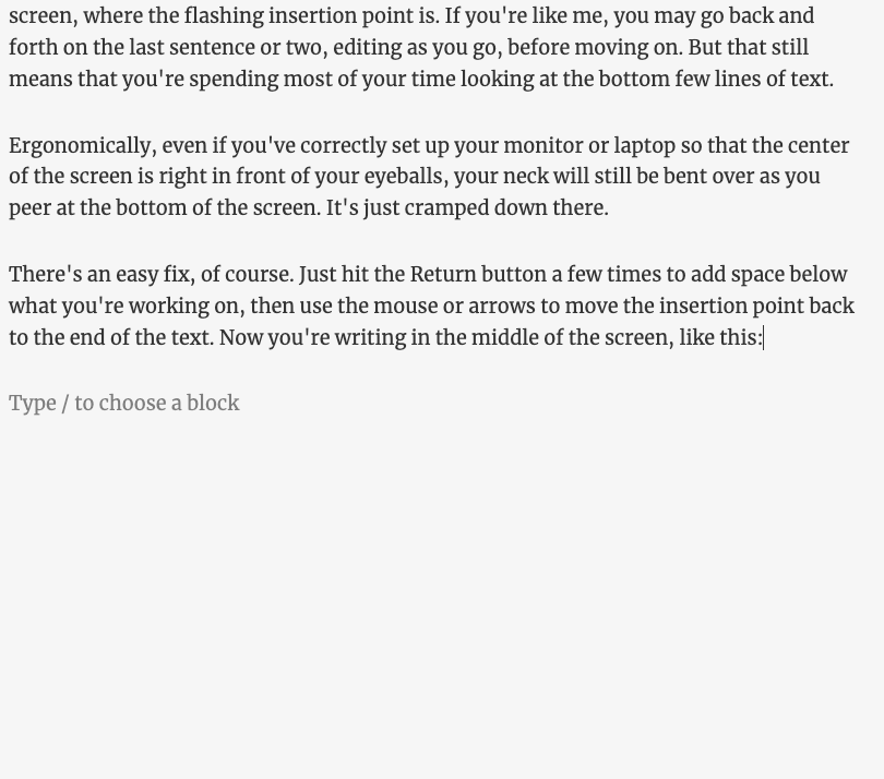
There’s an easy fix, of course. Just hit the Return button a few times to add space below what you’re working on, then use the mouse or arrows to move the insertion point back to the end of the text. Now you’re writing in the middle of the screen, like this:

Unfortunately, you’ve also got unneeded blank lines in the file. If you don’t remember to delete them when you’re done — and I often don’t — what you publish will have a strange blank space at the bottom.
Why it matters
This isn’t a big problem. It doesn’t get in the way of great writing. In fact, until I pointed it out, you probably never noticed it.
But it is a problem. It’s a niggling little annoyance that bugs me every time I write something longer than a few paragraphs. My writing tools should work in ways that make me most productive.
If something annoying is happening during 90% of your productive time, the people who make your tools should fix it.
How to fix it
Simple. Design writing tools so that they automatically scroll the view of the document to put the insertion point no more than two-thirds of the way down the screen. When the insertion point is at the end of a document, scroll the document to put that insertion point two-thirds of the way down, and show blank space below it.
Maybe you think showing blank space that’s not actually in the document is a violation of user interface principles. Well, consider what happens when you start a document. It shows the insertion point at the top and lots of blank space at the bottom — and that blank space isn’t blank lines, it’s just space for text that’s coming. If this display is okay for the start of a writing session, why isn’t it okay when you’ve written a few paragraphs?
I recognize that some people would prefer to type at the bottom of the screen because it gives them the ability to see more of what they just wrote above it. So you could make this a user setting. Let most people, like me, see the insertion point closer to the center of their screens. Allow people who want to opt out to put the insertion point at the bottom of the screen, the way it is now.
Does this make sense to you?
Do you know any tools that work this way?
Is there some secret setting in Word, Google Docs, or other writing tools that enable them to work this way — a setting that I failed to discover?
Why are we all writing at the very bottom of the screen? It makes no sense!
Interesting point – as you say, likely closer to 99% of us haven’t thought of this. I wonder if any of the word-processor-software manufacturers will see this and develop the solution as you suggest. Unlikely, but you never know … They sure won’t see the idea if nobody ever says anything about it.
Josh – ah, the fun of UX that hasn’t been examined in a long, long time.
I use the extra returns at the end all the time.
And like you, it irritates me that I have to do work that
My bet is that the analog of a physical typewriter scrolling paper has blinded UX designers to the mere possibility that we don’t have to mimic editing on paper anymore!
And not only there is no option to make a “keep your active editing area in the middle of the screen” automatic, once/if it exists, there should clearly be preferences for the user to set as they like.
Oy vey… lost some words in my comment…
“And like you, it irritates me that I have to do work that” should be:
And like you, it irritates me that I have to do work that is so damn easily solved.
I think this was done in the programme before Word; I have forgotten the name, but it used to maintain the line you were working on at the same level. It may have been WordPerfect, not sure.
I know the writing tool Scrivener can do this. I’ve found though, when the tool works to make the edit point fixed, there’s far more jumping around when I edit outside that fixed point. All that movement is jarring for me.
Reminds me of computer calendars that still show me a month at a time, and therefore make planning for the following month difficult. Show me two weeks before and two weeks after the day I’m on, dammit!
Good point!
Typora is a Markdown editor that has that feature. They call it Typewritter mode:
https://support.typora.io/Focus-and-Typewriter-Mode/