The best way to present instructions is in a list. The worst way is how this Amherst rental agency did it.
There are many ways to draw attention to elements of an email: bold, graphics, larger type, or even colored type or highlights. Using them all at once, heedless of graphic design, only amps up your customer’s anxiety. Reading instructions should not feel like attending a rave.
Today’s example is an email sent by a real estate agency in Amherst, Mass. Due to the surge of students coming back to five colleges around Amherst for the fall, the rental market is extremely tight and the anxiety of applicants is high. When one student recently applied, she received this email from a person at the agency (don’t try to read it yet, just look at it and imagine the general impression it creates):
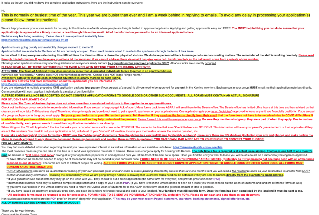
Having received this, what would you look at first? What is your eye drawn to? Would your anxiety increase or decrease?
Let’s have a look at some parts of this and how effective they might be.
Put your most important items in the opener
The subject line here is re: another message. With that unavailable to carry information, what matters is how the email opens. Here’s how it starts:
In this case, the applicant downloaded and followed the instructions on the agency’s website. But the email starts by criticizing the choice to follow those online instructions — apparently the forms on the site were the wrong forms — and then explaining that the agency doesn’t have the staff to do its job (“or busiest time of the year”) in large highlighted type. So the most important message is, “We’re swamped, you’re screwed.”
But if that doesn’t put you off, you can rest assured that the agency is happy to help, so long as you carefully jump through the exact hoops in the exact order to get approved. And the red type explains that you have to read this entire multicolor eye test, and hope you don’t make a mistake. OK, we’re hypervigilant now, so let’s read on.
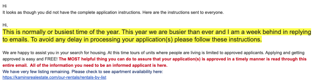
What works: Organization and spacing. What doesn’t: Repetition, colors, and bold
Consider all the attempts to emphasize things here, and what the result is:
There are two more instructions here to read everything carefully, both in bold and red. One is in all caps. Is saying the same thing three times actually more effective?
We have an exclamation point in the first sentence, several underlined sentences, and the word “ATTENTION:” We have notes about furnished apartments and single rooms (are these more important than the actual instructions further down?). We have lots of bold type. And we’re told that the information on leasing dates in the listing is, umm, in the listing.
Finally, we get a second link to the rental list that we already saw once, only this time preceded by red bold type.
The biggest problem here is a lack of spacing and organization. A simple bulleted list of these facts would be far easier to scan than all these different forms of emphasis. A bulleted list would make it easy to see the facts, which could be organized from most to least important, or in chronological order.
Finally, instructions on how to apply
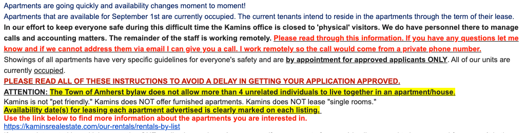
After all this foofaraw, you get actual instructions. Sort of. Here’s how that looks:
This is difficult to understand because it mixes information about how to fill out forms and how to return them. But regardless, the fact that it’s all in red makes it an anxiety-provoking eye test. Black type is best — lots of colored type doesn’t help readability. (If you use a black background on your email reader, as many students do, this red type becomes virtually impossible to read.)
And of course this once again repeats the 4-unrelated-people bylaw we read before.
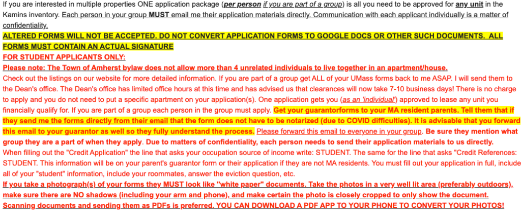
Continuing:
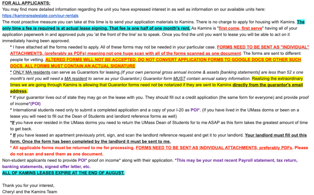
Finally, we get a bulleted list. But now we have cyan-highlighted bold text, italics, and even purple type (why is POI in purple, people?). We also have contradictory instructions (“Only MA residents can serve as Guarantors” and “If your guarantor lives out of state they may go on the lease with you.”)
How and why this sort of disaster happens
How did this document even come to be?
I think I can guess.
First, the person writing it has no idea how to think about presenting information, and doesn’t realize that their lack of skill in that area is not only confusing students, but is making their own job harder. Unclear instructions generate phone calls and emails. No wonder it is so busy at the agency!
Second, they wrote it at the most stressful time imaginable, instead of during the times of year when there are fewer students looking for apartments.
Third, it was created by accretion — adding bits as the author thought of them — instead of taking a holistic view of the whole information presentation problem.
And finally, it ignores three key principles:
- The most important information belongs at the top. And only one or two things can be the most important.
- The best way to organize lists of information is in bullets, not blocks of text without any spacing.
- If you use varying techniques to attempt to emphasize everything, you end up with an undifferentiated mess that emphasizes nothing.
What happened next is instructive
What do you imagine happened next? Here’s the rest of the story:
Two students who were prospective roommates filled out all the forms. I filled one out as the guarantor. The forms were, of course, confusing and poorly designed. As a result of submitting the forms, this rental agency now has a great deal of identifying information from us, including our social security numbers.
After that, two weeks went by. We were targeting a specific apartment, which remained available on the agency’s listing during those two weeks.
Finally, we received a notice that we were “approved.” The notice was filled with more unreadable multicolored type, just like this email.
However, at the same time we received that notice, the desired apartment disappeared from the agency’s website.
Did that mean that the apartment was reserved for us? Emails and, finally, a phone call revealed that of course that was not the case. They had rented it to someone else.
When things calm down, I’ll ask them to remove our private information from their data stores. I have very little confidence that they will be able to do so.
Formatting is often the orphan of other elements of clear communication. My sense is that it’s not taught unless students achieve some level of graphic design skill. Otherwise, it’s neglected and overlooked as a tool for clearer, more effective communication.
This, IMHO, is an excellent diatribe on the subject.
I find it interesting that if you can do one thing well (one non-writing thing, that is), people assume that you can also write effectively. This pops up in so many places. For example, in higher education, if you are a scientist and can plan and execute experiments successfully, it is assumed that you can also write journal articles (and grant applications), so no writing or editorial assistance is provided in most cases. That is a curious decision because it is self-defeating. Perhaps people find it hard to believe that in the digital age, writing continues to be paramount.
My eyeballs are demanding a two-week vacation after just skimming this example.
One of my colleagues used to write syllabi in this manner. I would immediately strip at the formatting and remove all caps.
I’’m off to get my eyes checked.
I feel anxious looking at this technicolor wall-of-words.
In a normal housing market (ample apartments to choose from), I wouldn’t even bother trying to fill out the application. Won’t waste my time struggling to decipher it. The landlord would lose my business.
And, I’d be wary of doing business with anyone who presents their initial requirements in such a disorganized, illogical way. Maybe it’s an irrational generalization but I’d wonder, “Will they be similarly chaotic/sloppy/careless in other aspects of doing business – for example, in handling my money or in keeping records?”
I encounter similar problems (but without the neon colors) when “deciphering” some instruction manuals that accompany furniture/devices that you have to assemble yourself.