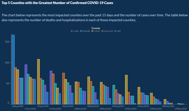
Because of this terrible chart in Georgia, people could die
Data is crucial in making decisions about reopening states. So is the visualization of that data. And the state of Georgia may have just published the most misleading and dangerous chart about virus infections ever. Here’s the chart. Take a close look. (You can see it bigger here.) The vertical axis is infections. The horizontal…