When infographics pass the point of diminishing returns
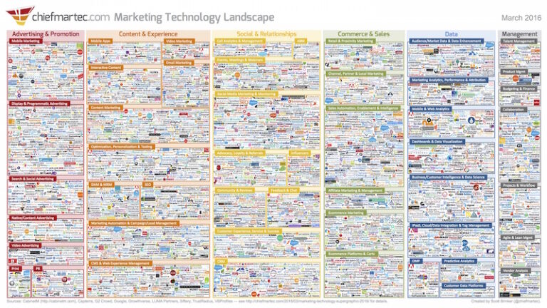
Infographics are supposed to have two related qualities: they’re useful and you want to spread them. Putting a whole bunch of stuff together in a graphic, no matter how cleverly, doesn’t necessarily qualify. When people do this, I’m left scratching my head. For example, Scott Brinker made this graphic that attempts to show all the vendors…
