When infographics pass the point of diminishing returns
Infographics are supposed to have two related qualities: they’re useful and you want to spread them. Putting a whole bunch of stuff together in a graphic, no matter how cleverly, doesn’t necessarily qualify. When people do this, I’m left scratching my head.
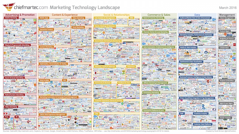
For example, Scott Brinker made this graphic that attempts to show all the vendors in the marketing technology landscape (full-res version visible here).

This makes one hell of a poster. It has “3,874 Marketing Solutions on one slide.” And I’m certain that Brinker learned a lot by shoehorning all those logos into one mosaic. As he told me:
Originally [I did this] to serve as ‘Exhibit A’ in the case that marketing has become a software-powered discipline. That case is probably settled by now. More recently, I think it’s a useful way of illustrating the evolving dynamics of software entrepreneurship in a rapidly changing industry such as marketing. [But now,] it’s mostly intended as a conversation piece.”
I could see this in a venture capitalist’s office, as an object warning about funding any more marketing technology companies. I admire the effort, like making a sand mandala. But as a practical tool, it’s useless.
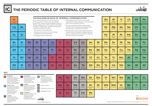
In the same vein, I came across the Periodic Table of Internal Communication, from alivewithideas.com.

According to this table, there are 124 elements of Internal Communication, ranging from Strategy to Mobile Site. According to Alan Oram, who created this with Chuck Gose:
There are so many aspects. But there is no central place to look at them, to understand what aspects are there and how do we structure those together. From that kernel of an idea, we put the periodic table of internal comms together. If you look at each element, we are explaining what each one of those means, with advice and guidance on each one of those elements.
Why a periodic table? “It was a nice way to wrap everything from a digestible perspective, see all the aspects in one simple table of information.”
When I interviewed Oram, he said over 1,200 people had downloaded this. Internal communications is a big topic for me, but I still don’t get how somebody would use this. It’s just a long list, dolled up in a graphical format borrowed from chemists.
I’m working on my own infographics now. Here’s my list of qualities that make them work:
- They’re useful.
- They cover one topic.
- They make a point.
- They’re clever.
- You want to share them so others can get the same insight.
Are the monster graphics I’ve shown useful in some way that I’m missing? Help me out here.
I’ve found the massive infographics that show wine and beer taxonomy useful and interesting. They helped me understand why I don’t like Muscat.
Agree with your points and enjoy your blog.
Trying to write with less bullsh*t….
You’re not missing a thing. They’re a mess. You list five criteria. I’m in accord with four but wonder if clever needs to be a requirement.
My experience is they can be mildly useful.
They support asserting a market is crowded and complicated. Sometimes I’ve found them helpful as a quick way to do cluster analysis as well.
I find the big infographics on agency and media ownership trees useful, particularly for explaining the space to someone new to the vertical.
Mostly I agree that the info presented is noise. If I was trying to educate or persuade I’d start with the higher level categories in the infographic as companies are two levels down in this busy tree.
I don’t think either of the examples is a good use of Infographics. How much information to include depends on where the graphic is going to be viewed.
There are a variety of storytelling techniques could help with interpretation of Infographics:
Complexity – one stat v. millions of data points
Context – put information onto a familiar scale, size, situation for audience
Point of view – yours, audience’s, victim’s?
Linear or non-linear – lead the audience through a story v. let audience explore information
Whether the graphic sits on social media, a website or in print affects design decisions too. The dimensions, font and file format that suit one platform rarely suit another.
I think I get an email from each of these Marketing companies every day. Not sure what id’ do without my spam filter!
On the contrary, I think that infographic about the marketing industry is totally useful. It shows how crowded & bloated the industry that’s trading in your personal data has become, and just how many entities are involved in watching you online.
But, that might not have been the original goal…
I loved the periodic table one because I’m a science geek. But I confess, I didn’t digest the information in it. That other one, the marketing tech infographic, is just gross. It does indeed convey the overwhelming array of offerings, but my brain will not command my eyes to actually read it.
Infographics have to be packed with useful information, but there’s the graphics side of the name, too. They need to be aesthetically pleasing so you want to read the information.
There are many information dense complex problem sets in the world. The modern world is increasingly impatient and unwilling to take the time to think carefully and with effort. The graphics you describe are a symptom of a society determined to condense complex concepts into “sound bites”. I believe there is some value in visual tools that help to organize thinking, however they should not be a substitute for active thinking.
Great minds, Mr. Bernoff…
http://www.philsimon.com/blog/big-data/never-confuse-can-and-should/
This is a similar post inspired by an equally awful graphic.
You were on top of it, Phil.
My view is that the purpose of infographics is to explain complex information clearly and concisely. None of the ones you posted do that.
The industry I work in is incredibly complicated, and unfortunately there’s hardly any good infographics, or any other form of communication method, to make it more accessible to lay people. It’s kind of stone-age really, in terms of making use of the software and technology available.
I think partly this is on purpose: if you make your industry impenetrable, you can command a higher salary. The most obvious example where this is true is the finance industry.