Statistics done right: The New York Times Upshot team analyzes pedestrian deaths
Let’s take a moment to understand how it looks when an article uses data effectively — and what you can learn from that.
There are so many abuses in media citations of statistics — from poorly conducted studies, to sloppy citations, to lack of transparency in sources — that I take notice when journalists do a particularly good job. In this case, it’s Emily Badger, Ben Blatt, and Josh Katz of the New York Times, analyzing why more pedestrians are dying recently in the paper’s statistics-heavy feature, “The Upshot.”
Answering questions
If I told you people were getting run over at a surprising rate, you’d probably have these questions:
- How much worse is it than before?
- When did it start getting worse?
- Are people worse drivers now?
- Are bigger cars contributing?
- Are people driving under the influence contributing?
- Are people texting while driving a major cause?
- What other patterns exist in the data that would yield insights into the problem?
A typical article on this topic would demonize some particular problem that gets people upset — huge pickup trucks, driving while high, driving too fast, driving while using a smartphone, young people driving, old people driving, and so on, pick your favorite — and then interview two or three victims to make an anecdotal but emotional case for solving the problem. And there’s usually data — often weak and questionable data — to support whatever you’d like to complain about.
But the Times analysis avoids all of that by using data to conclusively prove some key facts: the problem is much worse at night, there’s evidence that it’s caused by smartphones, it’s worse in the South, and most of the other explanations are just noise.
How bad is the problem?
Here’s the first chart in the article, showing that the decline in pedestrian fatalities from the previous century reversed in about 2008. (Already there’s a clue, because an important event happened in 2008 — but we’ll get to that in a moment.)
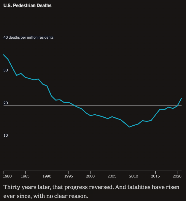
Notice that the chart is in deaths per million residents — a subtle but important metric that eliminates the factor of population growth.
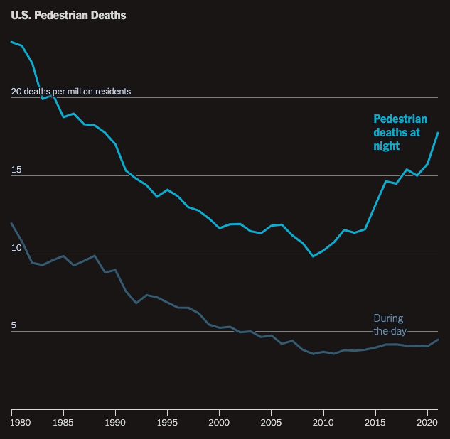
Next, the Upshot article makes the most important point right at the top: that most of the increase happened at night. Not only can you see that deaths at night are more than triple deaths during the day, but since deaths during the day are nearly flat, clearly the pedestrians being run over at night reflect the heart of the problem.
When it comes to data, comparisons are crucial
Whenever you read a statistic in an article, you should ask the question, “Compared to what?” As I describe in my book Writing Without Bullshit, the writer must provide context so the reader can understand the significance of what they’re reading.
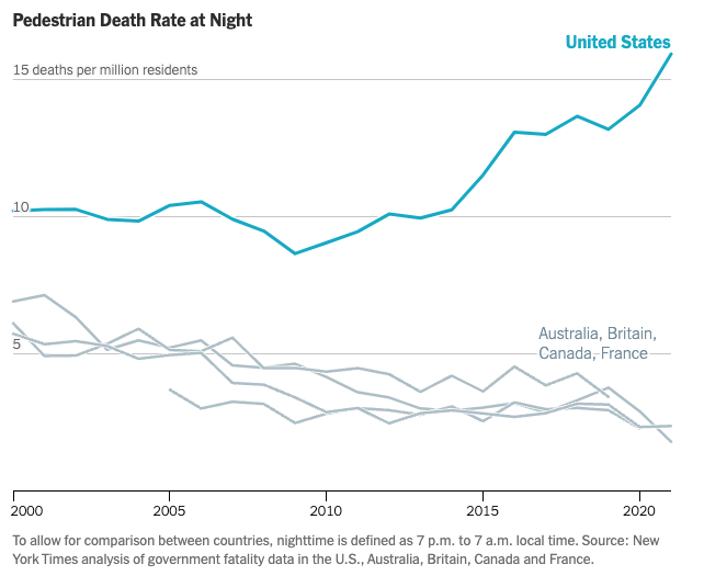
In this case, the Times writers compare US data to other countries, demonstrating that the trend in nighttime pedestrian deaths is very much an American phenomenon.
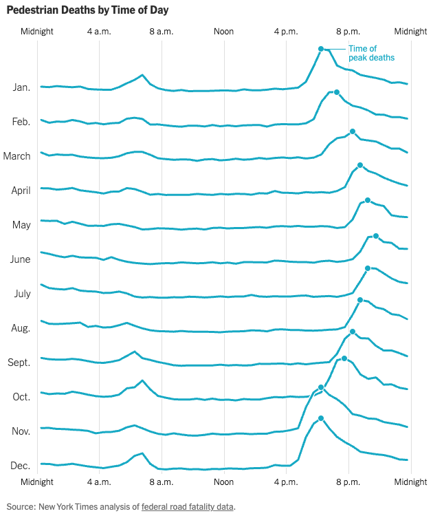
Next question: is it really darkness that’s the problem, or something else that happens at night, such as people getting drunk? Another graphic clearly shows that the deaths peak at dusk, even though the time that it gets dark varies month-by-month because of seasonal variations and Daylight Saving Time. The presentation of this data in stacked line charts is compelling.
Smartphones take the blame
Badger, Blatt, and Katz next make the case that the rise in smartphones, which became popular starting in 2007 with the launch of the iPhone, are the likely cause of the increase in fatalities. None of the other potential causes shifted dramatically in the exact time period in question. In Europe, most cars are manual shift, which makes it difficult to drive while manipulating your phone. But where would you get data to prove that people are using their phones while driving? You can’t ask them, they’ll just lie or misremember. But the authors find a compelling data source: telematics data. Smartphone use in cars peaks from 4pm to 10pm.
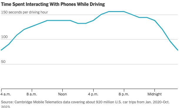
This is circumstantial evidence. You can’t tell if these are passengers or drivers. You can’t easily tell if people are interacting with GPS driving instructions or watching TikTok videos. So there is correlation here, but no proof of causation. Still, it strengthens the case for blaming smartphones.
What about other trends? The article provides evidence that other potential causes aren’t as likely as smartphones, although marijuana legalization might be a contributing factor:
Beyond just display screens, new vehicles have also changed to be wider, longer, taller and heavier. Not only do heavier vehicles hit pedestrians with more force, but they also often have worse brake times, meaning a driver who notices a pedestrian at the last second may strike that person at higher speeds. Studies have also indicated that vehicles with taller hoods are more likely to kill if they hit pedestrians; they strike people closer to the head or torso, instead of the legs.
While researchers have pointed toward vehicle size as a factor explaining America’s high overall rate of pedestrian fatalities, several said they were skeptical that it explains much of the increase since 2009. That’s because American cars were relatively large even before 2009, and the rate at which new cars replace existing ones is slow. . . .
[O]wnership of smaller vehicles (like sedans, coupes and station wagons) is down since 2009. But total pedestrian deaths from these same cars are up more than 70 percent, suggesting the bulk of the problem cannot be attributed to increased car size alone.
The behavior of drivers inside vehicles — of any type — may also have changed over this time for a few additional reasons, researchers suggest. This timeline also overlaps with the rise of opioids and the legalization of recreational marijuana. But there is little research about how marijuana affects driving.
Periodic federal roadside surveys, last updated in 2013-14, have found declining alcohol use by drivers and a rising share testing positive for drugs. A more recent federal study, collecting data from trauma centers and medical examiners about seriously or fatally injured road users, found in the years leading up to the pandemic that half of the drivers studied tested positive for at least one active drug. During the pandemic, that share rose to 65 percent. The results, the authors warned, “could be indicative of a growing problem.”
An unsuspected cause
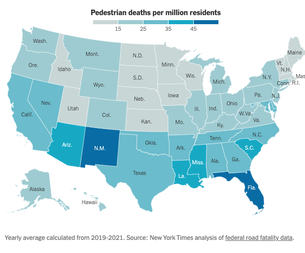
Is the problem the drivers or the roads? How would you test this? As the article points out, there are more rural roads without sidewalks in some parts of the country — and among heavily populated states, those with poor infrastructure are where pedestrian deaths are more likely:
Notably:
One theory is that Americans have been migrating toward the Sun Belt, including parts of the country that developed in the auto age, that have particularly poor pedestrian and transit infrastructure, and that have some of the highest pedestrian fatality rates. The rise in pedestrian deaths has been nationwide, with per-capita pedestrian fatality increases in 47 states since 2009. But many areas that have had poor pedestrian safety records going back decades — especially metro areas in Florida, Texas, and Arizona — have also seen the greatest recent population growth. . . .
Research has found that pedestrian deaths over the last 20 years have declined in downtown areas and increased in the suburbs . . .
Trusted statistics have transparent sources
Even if you are inclined to trust the Times, any source is far more credible if you can check the data and perhaps analyze it yourself. In addition to links throughout the article, the article includes this methodology section at the end:
Data on U.S. fatalities comes from the National Highway Traffic Safety Administration’s Fatality Analysis Reporting System, which records all roadway fatalities and variables about each incident, including the time, location, road and vehicle type involved and age of the deceased. The Times analysis identified nighttime deaths by comparing the recorded location of each pedestrian fatality with the time of sunset or sunrise at that location on that date. Unless noted, cyclists and other individuals not explicitly labeled pedestrians in the data were not included in our analysis.
International pedestrian fatality data comes from the Australian Road Deaths Database, Britain’s Department for Transport, Canada’s National Collision Database and France’s Observatoire National Interministériel de la Sécurité Routière.
The group of “smaller vehicles” refers to those categorized as “passenger vehicles” by the National Highway Traffic Safety Administration and Federal Highway Administration. This includes sedans, coupes, convertibles, hatchbacks and station wagons — but not trucks, minivans or S.U.V.s. Registration data was used to track declining vehicle ownership among this group.
You should write about numbers this way
Learn from what the Upshot team at the Times did well:
- Define the problem clearly.
- Put your main conclusion at the top.
- Use charts to show your analysis of contributing factors.
- Consider alternate explanations; use data to analyze those as well.
- The more contentious the issue, the more dispassionate the language you should use to describe it.
- Always present data with comparisons to add context.
- Be transparent about your data sources.
You may not have the time or budget of this team, but you can certainly take lessons from the clear, effective, and unbiased way in which they presented their data.
Is the denominator correct? Per million residents. Usually, we think of a distance traveled. Note: other countries do use different denominators.
We also think about things that change that reflect an improper denominator. Did more people walk? Did they walk more? Did they walk at different times? Did they walk on sidewalks or shoulders or?
The stacked graphic is missing the units (what are the lines). Only time is indicated. It does say deaths, so maybe it is only missing the actual numbers
How do we figure in the fact that e-devices went from zero to over one hundred percent penetration and deaths went down?
Did cars get safer? For whom?
We also think about the hierarchy of safety measures. Personal protective-ish equipment is at the bottom; just above is praying that folks driving and walking are doing well in those tasks. Driving is usually the hardest task that most folks do the most often.
E-devices, drugs, and alcohol share one thing we have not yet figured out: in the lab, all three cause issues, but on the road only alcohol seems to cause significant issues. But we know how to get alcohol and drug under control—develop a mindset to not drive (nor walk, which is most dangerous!) and take a ride. We just need to set that up before we partake. As I say, the problem with impairment is impairment. Oh, we don’t know how to test for impairment in mj. We often test wrt drugs for presence, not impairment.
Oh, shoot, we suck at collecting crash data. Fatalities we get as it is hard to hide a body, but crashes and non-crashes are terrible and we often don’t do more than count them if we find them.
E-devices are still confusing. confounding factors are that passengers use e-devices, e-devices do useful things, and distractions are useful at low levels.
To summarize, we don’t have good data, we don’t do good analysis, we understand a lot that we don’t act upon, and in the US, we are comfortable with about 40,000 deaths a year from autos. And deaths are at or near an all-time low as a rate with a travel denominator.
Fascinating. Question: Could it in part be due to pedestrian use of smartphones? Here in NYC I’ve seen pedestrians wander into traffic distractedly while looking at smartphone.