New Red Sox uniforms. The horror. The horror!
On my Facebook profile, under “religion,” it says “Red Sox fan.” So I cannot remain silent about the special set of uniforms that the Boston Red Sox and Nike unveiled for the team to wear on April 17-18. Here’s how they look.
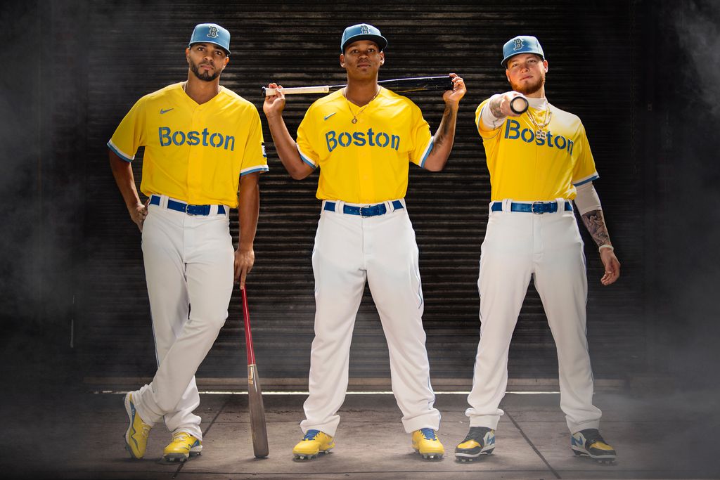
I apologize if this photo has made you come close to losing your breakfast.
I am going to teach you a new word, because we need it for these uniforms. It is a Yiddish word, sometimes spelled “khaloshes” in English. It’s pronounced sort of like “ha-law-shess,” but the initial h is a throat clearing sound, as in Hannukah or the Scottish “loch.” After the back-of-the-throat “kha,” the rest of the word rhymes with “luscious.” But the meaning is anything but.
It’s important that you expel the word from your mouth, like a sneeze. Kha-LAW-shussss!
What it means, according to the Yiddish authority and humorist Leo Rosten, is “a revolting, disgusting, or loathsome thing.” And in my childhood, I learned it was the exact word to describe a design or decoration choice so ugly and awful that it prompts an immediate visceral reaction.
These uniforms are khaloshes. They make me ill.
Aren’t the Red Sox allowed to embrace a new look?
The Red Sox team is over 100 years old. It is still playing in the same amazing ballpark, Fenway Park, which is a shrine to baseball. Until 2004, the Red Sox were mostly known for coming close to winning it all, but always failing at the last moment — the so-called “Curse of the Bambino.” Since then, they’ve won four World Series, but lately, they stink. Last year’s squad was the worst team in recent memory, which, combined with the COVID-shortened season and lack of fans in the seats, was very sad.
This year’s team has started the season with three losses to the lowly Orioles, but they still seem to be better than last year’s. We could all use a boost right now, and in Boston, cheering for the Red Sox could be that boost.
There is a challenge in exciting a new generation of fans about baseball, a game which has gotten dull as there are longer games, lots of boring pitching changes, and fewer balls in play.
While the game itself needs improving, there’s certainly an opportunity to update the uniforms to make them more appealing. But let’s not throw out a hundred years of tradition.
For example, here’s David Ortiz in the standard Red Sox uniform.
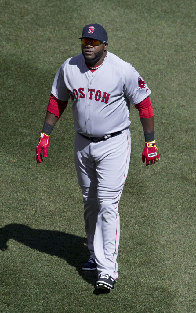
Classic.
There are two key elements to the Red Sox uniforms; the circus lettering and the red and blue color scheme. (Red is right there in the name, after all.) I think you can change one or the other of these elements and retain a link to tradition, but not both. For example, here are some alternate uniform colors that look pretty cool but preserve the circus lettering, including green uniforms for St. Patrick’s day and camo hats for Veterans’ Day.
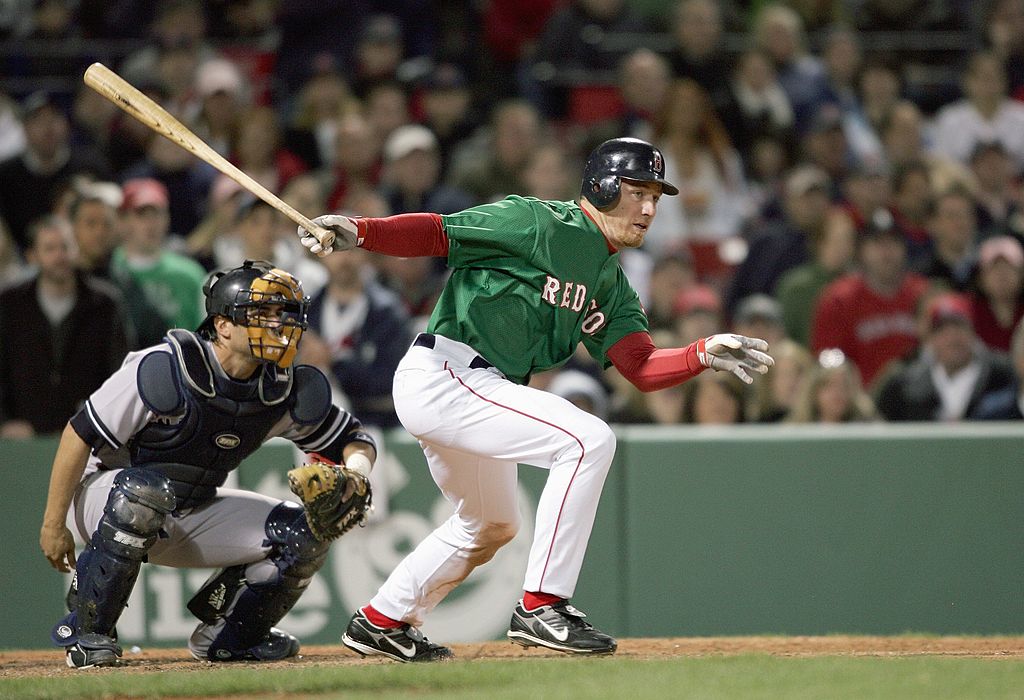
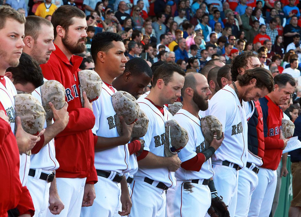
And you can get away with changing the lettering if you preserve other elements of the look, like this classic road uniform.
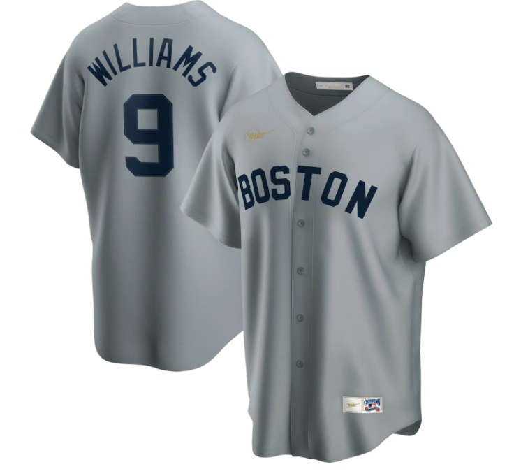
Where the Red Sox and Nike went wrong
The new Nike/Red Sox uniforms are mean to pay tribute to the Boston Marathon, which has blue and yellow colors. Here’s some Marathon gear that looks just fine.
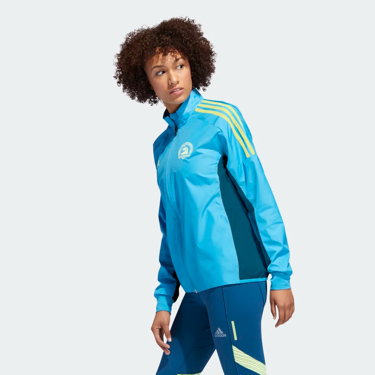
But graphically, those colors say “Marathon,” not “Red Sox.” That color scheme is pretty far from the Sox colors.
The lettering on the new gold Red Sox uniforms is meant to pay tribute to stenciling on the street.
Each of these decisions may have seemed logical at the time. Why not use gold and blue to pay tribute to the Marathon? Why not use lowercase sans-serif stencil lettering for the same reason? But you put all those decisions together and you get a disgusting combination that has nothing to do with the Red Sox.
Take a look at poor Raffy Devers. This is an exciting young hitter who’s trying to get better at the difficult task of fielding at third base. I’m making a prediction right now: Raffy is going to make three errors in two days while wearing this yellow horror. Call 9-1-1, because this uniform is a crime in progress.
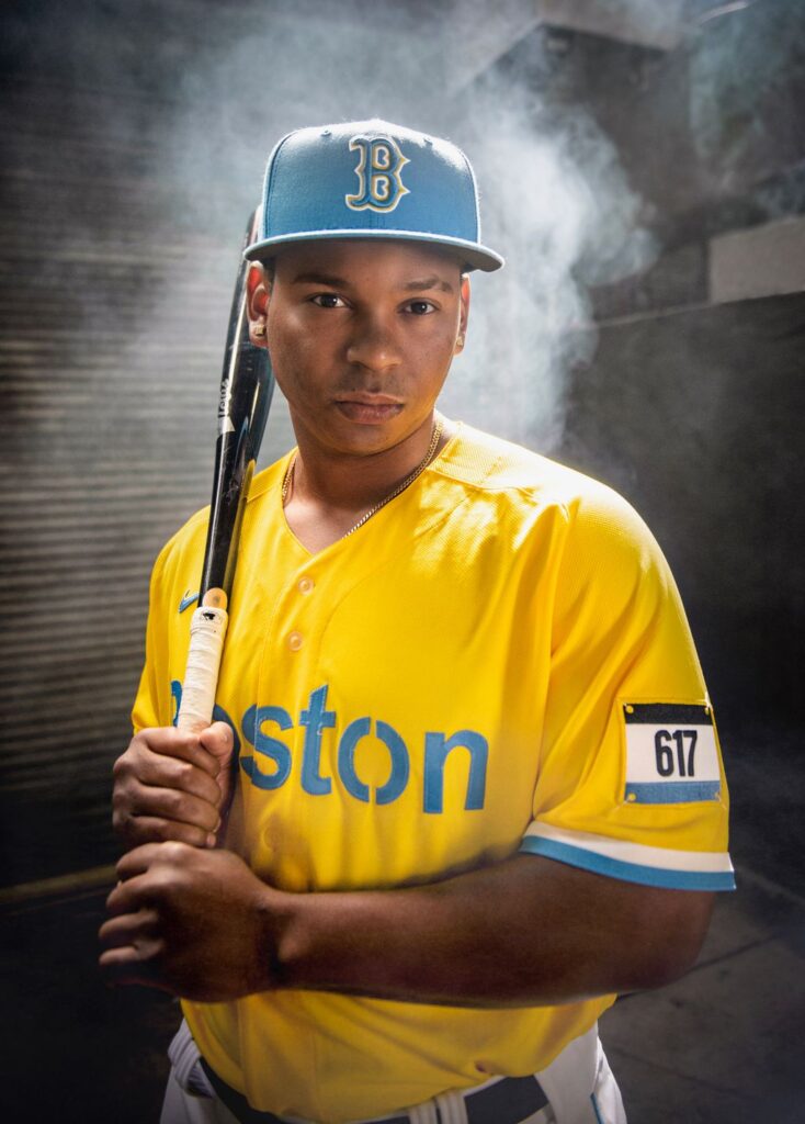
It really is the most khaloshes thing worn by baseball players since the Astros in the 70s or the team formerly known as the Tampa Bay Devil Rays.
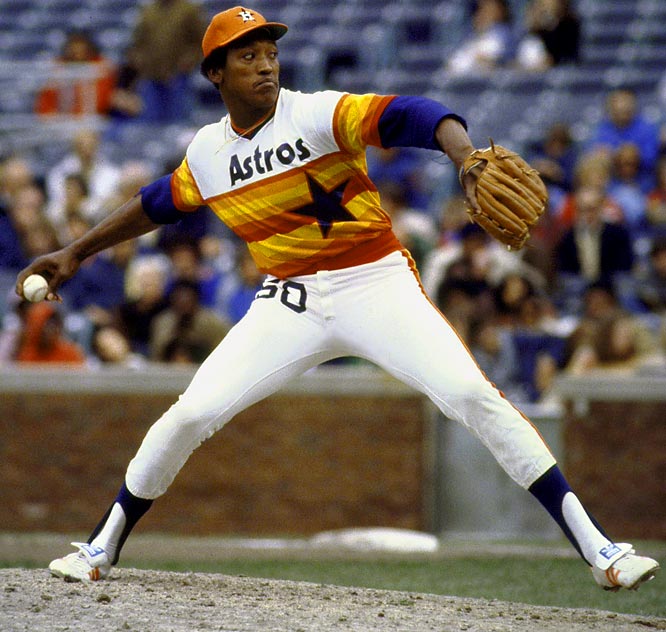
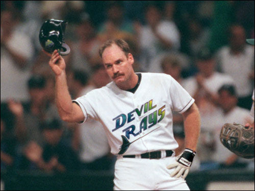
Fair warning. If you buy one of these “gold” — ahem, admit it, they’re yellow — Sox uniforms and wear it in public, people will laugh at you. And you’ll deserve it.
If this is the Red Sox’ way of distracting from the team’s troubles, it’s not working.
It looks like an homage to Ikea.
Josh, I love your passion!
I LOVE this. Totally thought it looked all off when I saw the announcement yesterday. You’ve nailed what’s wrong with it. Though, I do like the “617” patch on the arm.
Well, Boston marathoners are stoked!
This is marathon weekend, they are trolling Adidas
Mistah Kurtz, he running the front office now?
I thought they were an imitation of the Oakland A’s gold jerseys. I mean, NO else deserves to wear the gold!
Oh, the humanity!!!
Well,, at least they kept the circus lettering on the caps. By the way, I always liked that lettering but never knew it was called circus lettering. Thanks for enlightening me.
The Sox should’ve kept the red socks. They would’ve clashed with the marathon colors, but would have provided a link to reality.
If the Sox keep playing as badly as they have been, the new colors can serve as a replacement for “The Curse of The Bambino.”
UGH !
Did they actually want this new look or did they loose a bet?
OK, I like the color yellow, and my favorite color is blue. But that yellow is gosh awful! And, for some reason the powder blue never looks right to me in a baseball uniform. The traditionalist in me hates the san serif print of Boston. Did anyone from Boston help design these horrible things? Please burn them!
The Boston Red Sox have finally decided to destroy their history and heritage. The unbelievable switch to white/yellow/baby blue uniforms clearly say they have given up in every way possible. Not only have they turned their backs on their history and heritage, but they have adopted THE UGLIEST UNIFORMS IN MLB HISTORY!!! I am ashamed of the Red Sox as both a Major League Baseball fan since 1969 and a New York Yankees fan since then also. I’ve always considered the Red Sox to be the second best team in baseball (behind the Yankees), but now I think they’ve dropped to the ABSOLUTE WORST, based solely on their new uniform choice. They should be banned from the league based on their total disregard of their history and the history of baseball. SO, SO SAD TO SEE THIS!
By the way, Ted Williams is turning over in his grave.
I believe you mean his cryogenic tank, but yes.
I am a yankee fan but i actually feel bad for them. They look like they work at long john silvers
Gawd awful uniforms! Red Soxs look like they are the minor league team for the Savannah Bananas!
God is not the author of confusion.
As a Twins fan, I no longer feel quite so bad about those blue and yellow abominations the Minnesota boys have to wear. But wtf does this color combo have to do with the Boston RED sox? Ick. Yuck. Puke. (you get the idea)