Make an Idea Map to visualize your book’s idea flow
Some nonfiction books just seem to flow naturally from idea to idea. Others seem repetitive — as if the author is just hitting the same idea again and again. An Idea Map can help you visualize your concepts and organize them to avoid repetition.
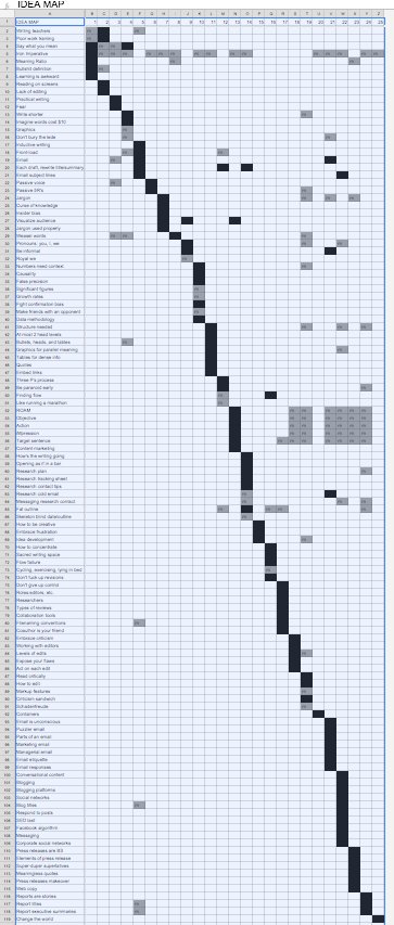
I’m nearing completion on my manuscript for Writing Without Bullshit, and I wanted to monitor how I used ideas throughout the book. I made an Idea Map in Google Sheets, as shown below. Across the top are 25 chapters. Down the left side are all the ideas I hit in the book. A black cell indicate major treatment of the idea; a grey cell is a mention of that idea. Don’t worry about reading the content; concentrate on the pattern.
Here are a few things to notice:
- A few ideas come up in many chapters. The fourth row is the Iron Imperative (“treat the reader’s time as more valuable than your own”), which I hit again and again. And as you can see from the grey block about halfway down, I introduce the ROAM analysis in Chapter 13 (Readers, Objective, Action, iMpression), and the use it in many of the subsequent chapters.
- For the most part, I feature ideas in one chapter. That’s what the black diagonal running top left to bottom right tells you. Anything that’s off this diagonal indicates an idea that comes up in multiple chapters. If lots of your ideas are coming up in multiple chapters, you’ve got an organizational problem (and the reader will find your book repetitive).
- There are a few forward references. A forward reference means talking about an idea before you actually define it. On this chart, it appears as a grey square preceding the black square in the same row. For example, I mention fat outlines two chapters before I go into detail, and I refer to filenaming conventions in Chapter 5 and then go into detail in Chapter 17. I also mention concepts like passive voice and weasel words before I get into detail. You have to be careful; too many forward references make readers uneasy.
- Matrixed ideas generate off-axis mentions. You’ll notice that the last six columns (chapters) generate a bunch of mentions of earlier ideas, as shown by the smattering of grey squares in the upper right. That’s because those chapters cover formats (such as email, blog posts, and reports), and as I discuss each format I apply writing concepts that I introduced earlier in the book.
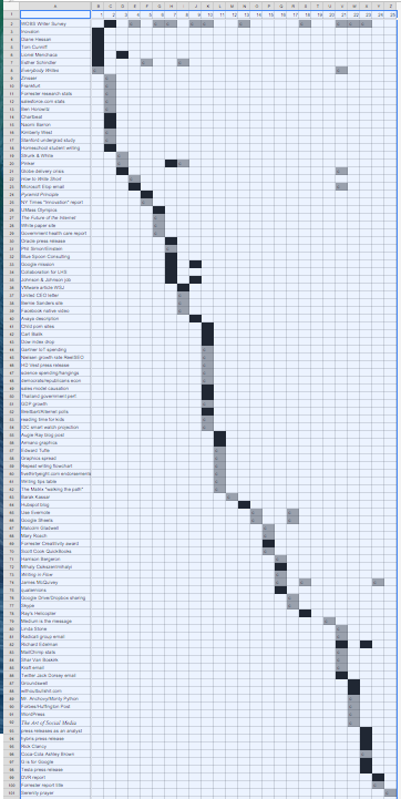
I also did an example and citation map on the same principle (see below). This can help you to make sure you’re not using the same example in too many places, which makes your writing less convincing. Repeated citations appear as off-axis squares.
In this case the first row is the WOBS Writer Survey, which I cite in multiple chapters. There are a few people who I feature as “heroes” in multiple chapters, and I cite Ann Handley and Steven Pinker a few times each. There are also a couple of examples I come back to more than once, but for the most part, it’s new examples and citations in each chapter.
If you’re having an organizational issue with a book or other large piece of writing, and especially if you’re worried about distracting repetition, try this approach. You’ll see where the repetition is coming from and which examples you’re overusing, and then you can fix it.
Thanks, useful!
Brand-new-to-me concept, and one for which I can find several applications. Thanks for the pith.
Thanks. This works for fiction, too.
Wow. Josh, this is amazing and extremely useful. Of course, it requires crystal clear writing. It requires being completely aware of what your key ideas are… and knowing when you are mentioning them. That doesn’t come easily to everyone. KUDOS!!
Thanks Josh. This was a fresh way to look at concepts and structure.
Can you insert a legible version of the map? I’d love to read what you put up.
Sorry, Phil, not quite ready to reveal every idea in the book 8 months before the pub date 😉