How authors should review a publisher’s page design
At some point in your book’s publishing cycle — typically after you’ve submitted a manuscript for copy edit, but before you see page layouts — your publisher will share a page design and a full cover design. (If you’re self-publishing, you’ll review test designs from the designer or publishing services company you hired.)
Remember, it’s your book. You have the right to review the design to make sure it matches your vision of what the book should look like, and to ask for changes. If you don’t, you have only yourself to blame if the book doesn’t live up to your image for it.
Here’s a list of things to review in that design to make sure the final book looks the way it ought to.
Cover elements
By this point, you’ve usually settled the basic design of the front cover or dust jacket. But a cover is not just a front-cover graphic. So review these elements as well:
- What front-cover elements will be added to the basic design? These might include a quote from a prominent person, “With a foreword by xxxx,” or the publisher’s logo.
- What does the spine look like, and how does it relate (in terms of colors and fonts) to the front cover?
- Are the title and author names correct? (Yes, I’ve seen cover designs that misspell the author’s name.)
- How are the front cover graphics carried onto the back cover?
- What the treatment of back-cover text and quotes?
- What’s the treatment of the author photo and short author bio?
- If there is a dust jacket, what’s the treatment of the book description?
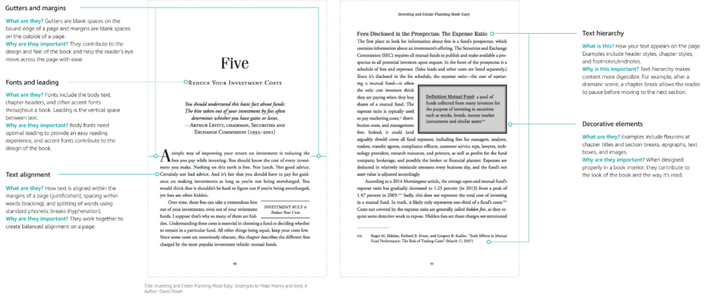
Inside text elements
Make sure the main design of the book text looks the way it should.
- How does the choice of body text font look with your actual text inserted?
- Is the layout space-efficient, crowded, or open — and is that choice appropriate for your text? How does the number of pages compare to your manuscript pages? (I write in a Microsoft Word template with 12-point Times New Roman body text, double spaced; in that template, there is typically a one-to-one ratio of manuscript pages to 5 1/2″ x 8 1/2″ typeset text pages. But that ratio can vary based on the actual type size, layout, and page size that the designer uses.)
- Are italic phrases readable? If there are large blocks of italicized text, how does it look?
- How do numbers look? (In some fonts, numbers are idiosyncratic; in non-fiction books, they way numbers look is important.)
- What’s the treatment of paragraphs, spacing, and indentation? What is the font size and leading (space between successive lines)? Does the text looked cramped or spaced out?
- Do the margins look too wide or too narrow? Are they appropriately wider in the “gutter” at the center of two-page spreads?
- What is the treatment of block quotes? Is is large enough to be readable, but clearly different from regular body text?
- What is the treatment of A- and B-level heads? Are they set off appropriately from the text? Are they capitalized the way that you prefer (typically title case or sentence case)? Can the reader easily distinguish different head levels?
- What is the treatment of bullets or numbered lists?
- What is the treatment of sidebars, if any?
- What is the treatment of pull quotes, if any?
- What is the placement of running headers or footers, and are you happy with how they look?
- How are running headers or footers different between left-hand (verso) and right-hand (recto) pages. Often, one will have a chapter title and the other the title of the book.
- Are there footnotes or endnotes, and how do they look?
- What is the treatment of the index?
- If the internal text is in more than one color, how does the design use color to highlight different elements such as heads?
Internal graphical elements
In addition to ordinary text, every nonfiction book has unique graphical elements that you should also review.
- How does the full title page look? It should reflect the outside cover design, but is typically simpler and often in shades of grey rather than in color.
- Is there a half-title page, and how does it look? This is typically the first page of the book, and should show just the title in a design simpler than the full title page, with room for an author signature when you’re signing books.
- How does the table of contents look? The graphical look of the table of contents is important, since many readers will review it to decide if the content of the book is worth investing time in.
- What is the treatment of part dividers? A typical nonfiction book will have three to five part dividers for major book sections. They deserve an interesting design that reflects elements of the front cover.
- What is the treatment of chapter openers? Make sure that it is appropriate for the length of chapter titles you are using, and matches both the body text and other choices of fonts and graphics in a way that seems natural. Take note of whether all chapters will start on recto pages (an elegant choice, but one that boosts the page count and sometimes leaves blank pages), or whether they’ll always start on the page after the previous chapter, regardless of whether that is a recto or verso page.
- How are graphics treated? This includes captions as well as the actual rendering of the graphics. Often, publishers or publishing services companies will re-render graphics with fonts that match the fonts in the rest of the text, but you should check this if it matters to you.
- Are grey scales in graphics easy to distinguish from each other? Sometime similar grey scales in printed text are hard to tell apart.
- If the graphics were originally in color, how do they look when translated into grey scales (assuming your book interior is not in full color)?
You can do this
You may not be a whiz at design, but you probably know what you like. If the fonts seem wrong, the spacing looks off, or the graphical elements feel-ill matched to the text, you have a right to ask questions. Designers like intelligent feedback — if you’re clear about what you hope to accomplish, they’ll likely respond positively to your feedback. Do it now, because once the layout is complete and the book is printed, you’ll have missed your chance to be heard.