How do you create great infographics? (Ask Dr. Wobs)
To create effective infographics, you need to have something to say, and then you need to tell the story graphically. Today’s Ask Dr. Wobs answer explains how to do that.
Dear Dr. Wobs
I’m inspired by your infographics that illustrate how to write without bullshit. I’d like to create some of my own for my audience. How do you create them?
Cheryl Hulseapple, Schenectady, New York
Cheryl, I was in the same position you are a few months ago — wishing I had some infographics worth spreading. Now, I’ve got a whole slew of them. Here’s how I did it.
Review your content
I’m in the fortunate position of having a wealth of content worth sharing from 300+ blog posts and a book. But not all of that content is appropriate for an infographic.
Infographic content has to have two qualities:
- Appropriate for a graphical treatment
- Interesting enough to spread
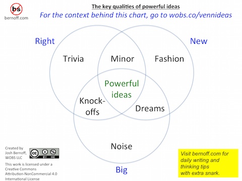
It’s easy to hit one of these qualities and miss the other. For example, my posts about Donald Trump’s debating style are quite popular, but not particularly graphical. At the other end of the spectrum might be my concept of what makes ideas powerful, which is graphical but wasn’t interesting enough to spread (see below).

But when you’ve got a concept that fits both of these qualities, you can begin working it as an infographic.
Find a graphical story
A good infographic is a graphical story. It basically says “Here is a quick way to understand something important.” If it is a story about something that people care about, it will spread.
Here’s what happens in the reader’s mind when they see an infographic worth spreading:
“What’s this? Oh, it’s about [topic I care about]. Wow, this is everything I agree with in one place. It explains it so simply. I’m going to print this out/post this on Facebook/email it to the whole department, because maybe then people will understand.”
Unless you can imagine a lot of readers saying something like this, you’ve probably got the wrong topic for an infographic.
Get a designer
Maybe you have graphical talent. I don’t. Jeremiah Owyang took one look at my graphics and said “Get a designer!” So I did.
An infographic designer needs taste, a facility in complex designs, and the ability to communicate with content creators (that’s you). A designer who makes a fantastic logo isn’t necessarily the best choice. Neither is a designer who specializes in page layout — this is a graphical task, not a brochure or report.
You want an expert in information design — the ability to tell stories, attractively, with words and pictures. I found a couple, both of whom I had previously enjoyed working with at Forrester.
Write your story in text and sketches
If you’re like most readers of this blog, you have a lot to say. But lots of words don’t work well in infographics. Can you slim down your story? Write a skeletal, outline version of your infographic. You’ll need a top heading, about ten more words of explanation, and then something structured — a set of subheadings, a table, or a flowchart for example. Rough up a sketch in PowerPoint or on paper.
Remember that infographics read vertically. They should tell a story worth telling, from top to bottom.
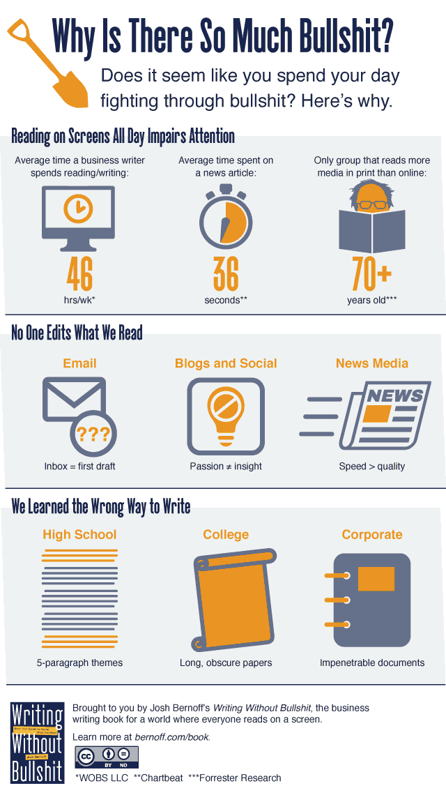
For example, here’s what I gave the designer to explain why there is so much bullshit:
Why There Is So Much Bullshit
Does it seem like you spend your day fighting through bullshit? Here’s why.
—
Reading on Screens All Day Impairs Attention
- Average time a business writer spends reading/writing: 46 hrs/wk*
- Average time spent on a news article: 36 seconds**
- Only group that reads more media in print than online: Age 70+***
No One Edits What We Read
- Email: Inbox = First-Draft
- Blogs and social: Passion ≠ Insight
- Media values: Speed > Quality
We Learned The Wrong Way To Write
- High School: 5-paragraph themes
- College: Long, obscure papers
Fear Generates Bullshit
- Hedging
- Passives
- Indecisiveness
- Weasel words
—
[Book cover] Fight bullshit. Boost your career. Say what you mean.
Notice how different that is from the 1000 words or so I published in the The Observer on the same topic. The writeup had only 150 words, and eventually that turned out to be too many (in the end I cut the last section).
The words I did include were relatively easy to illustrate: statistics, pseudo-equations, and concepts like college papers.
Now talk to your designer
The designers I know aren’t great talkers. They’re great listeners.
You can’t just toss the outline over the fence and expect a good result. For each of my infographics, I talked to the designer for 15 or 20 minutes and tossed around ideas. If you tell a designer exactly what to do, you won’t get the full benefit of their creativity. If you tell them nothing, they’ll go off in an unproductive direction. But a short discussion usually bubbles up some good ideas you can both agree on.
It typically takes two or three drafts to get a design worth using. Both the designer and the writer have to adjust their ideas. For example, we tossed around different ideas on how to illustrate the numbers in the first section. I suggested that Bernie Sanders type image would look more like an old person than a bald one, which is how Bernie got into my infographic. Other elements, like the shovel and the scroll, were the designer’s ideas. We went back and forth a lot of times on the whooshing newspaper in the second row until I was happy with it — other elements made me chuckle or smile right away so I knew they were right.
Here’s what we ended up creating from the outline above:

Include a payload, then spread it
The infographic has no value if it doesn’t point people back to you in some way. Figure out what you want them to do, then include a link or graphic that suggests that they do it. In this case, I wanted people to buy the book, so I put the book cover at the bottom. (There is no tragedy as sad as an infographic that spreads like mad without doing its creator any good.)
To spread it, you need to launch it into the world. Facebook, Pinterest, Flickr, a blog, Twitter — use as many as you have. If you have friends with a big megaphone and a lot of followers, see if you can get them to spread it.
There’s a lot more to creating infographics than I can cover here. For some expert advice, check out these posts from KissMetrics, Creative Bloq, and Social Marketing Writing.
Suggestion: If you want to write to all your readers everyday, fine, but set it up an option that I only receive all your emails once a week not everyday.
Everyday is much to much.
Dan