Christopher Penn vividly makes clear the varied architecture of political influence
I’m grateful to Christopher Penn, cofounder of BrainTrust Insights, for his analysis of link and influence on both sides of the political spectrum.
Yesterday, he posted some incredible graphical visualizations. Here’s how describes what he did:
Using Facebook’s API and its Crowdtangle journalism tool, we extracted 6 months of data from approximately 250 conservative and liberal Pages with at least 100,000 Likes per Page, totaling 560,000 posts. Of those posts, we filtered them down to approximately 200,000 posts that contained links to pages outside Facebook – news sources, etc. We reduced individual news stories down to their root domains for easier interpretation; for example, cnn.com/2018/86/etc. becomes cnn.com in the dataset.
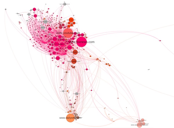
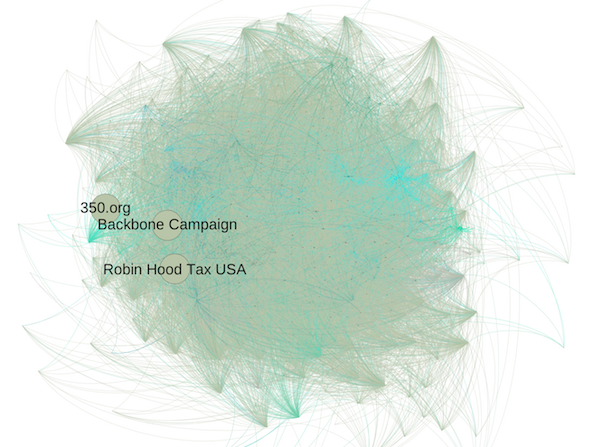
Once analyzed, we graphed the relationships between Pages and the news sources they shared. We first visualized the most cited websites, then reversed the data to show the most actively-linking Pages. The visualization was done in the open-source software package Gephi.
For reading and interpreting the maps:
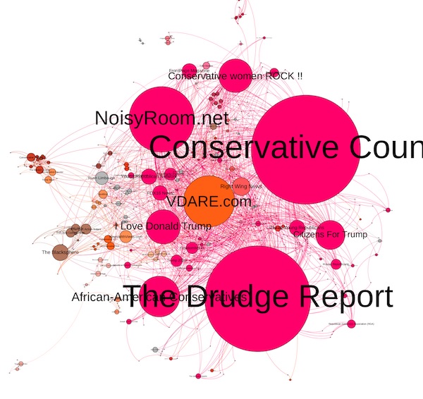
– Colors represent thematically similar hubs. The closer in color, the more related the contents being shared.
– Circle sizes represent the number of times that hub is referenced, a proxy for its importance. The bigger the circle, the more important it is.
Take a look at the resulting graphics — and how different the liberal and conservative connection graphs are.
If you want to reproduce or use these graphics, please get the original, high-resolution versions from the Brain Trust Insights site. Note from that site: “You are welcome to reprint the above data for non-commercial, academic, or journalistic purposes with citation. Please cite BrainTrust Insights and link to this page in your articles and content. Commercial reproduction is prohibited without prior written permission.”

From braintrustinsights.com. Penn’s caption: Graphic 1 of 4: The most linking conservative Pages. These are pages who link out the most. What we see are some major hubs such as Conservative Country, Drudge Report, and others, tightly clustered. This is a highly-ordered network map; the denseness and closeness of the different nodes indicates a common set of themes and perspectives.


What can we learn from this analysis?
Conservatives see bias in “mainstream media” sites; this is what spurred the creation of Fox News in the first place. With these maps, we see a conservative news ecosystem that is far more concentrated than the diverse liberal news ecosystem. This affects the definition of “truth” for both conservatives and liberals. Conservatives are more likely to see the same stories from a relatively small set of sources repeated in what they read. Liberals are more likely to consume and share content from a variety of sources.
Facebook exaggerates these tendencies by showing conservatives more of what they expect to see and liberals as well. It’s an essential part of the concentration in the top two charts. Add in Donald Trump’s Twitter feed and you have your own separate reality.
This analysis suggests two questions.
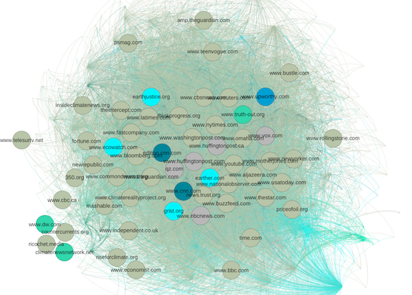
First: will liberals be creating a nexus for action, so their graph can look more like conservatives? As Penn says, “On the conservative side, we see a media infrastructure optimized to elicit action from its audience. A few central hubs on both the Page and site maps indicate strong thought leaders that set the topics of conversation and tone.” There is no monolithic source of truth on the liberal side — MSNBC, which you would expect to occupy a space similar to Fox News for conservatives, isn’t even visible. If a liberal thought leader emerges from the cloud (Elizabeth Warren? Rachel Maddow? Bill Maher? Pod Save America?), you have to wonder if they could occupy that position. Given the diversity if influence, I doubt if there’s much danger of creating a concentrated ecosystem as conservatives have, but I wonder if the mechanics of Facebook might make it possible for such a leader of liberal thinking emerge.
Second: are the mass of conservatives destined to get their news from fewer sources, or could this trend reverse? Even at Fox News, conservative thought is split between the Trump-backing Hannity side and the more mainstream and skeptical Shepard Smith. Could a new network emerge around traditional conservative voices like Smith, Megyn Kelly, David Frum, and William Kristol? (In honor of the conservative thinker who died yesterday, they could call it “The Krauthammer Network.”) Such a source could create a split in the conservative ecosystem and generate a more diverse set of viewpoints.
We can all dream of a world where everyone reads diverse news sources and decides for themselves what the truth is, and where their opinions lie. These graphs make me believe there is no future in which that world exists. We can only ask if these graphs will change, not if they’ll disappear into a mist of diversity.
Thanks again to Christopher Penn for making us think with these provocative pictures. He’s a true analyst. I would love to see more analysis like this.
I’d love to see this graphic for Libertarian perspectives!
That would be interesting!
This was very interesting and I was happy to see the analysis. Sometimes some of us get a bit “bogged” in extrapolating a “meaning” from graphics! I was also surprised to see that on the Liberal side there wasn’t a huge nexus. If the collective we became less isolated would we become more moderate rather than migrating to the fringe? Josh – do you think it is in some ways odd that the more globally interconnected we have become (internet, supply chains, cooperatives) that pockets of rabid isolationism (Nationalism?) have become fired up and raging?
I know that “quality” may be a qualitative term to some, but did you avoid discussing the quality of the links because you see it as irrelevant to your point or for some other reason? Becuase when I see the websites to which liberal and conservative sites link, the word “quality” seems hard to avoid. Any objective review of the bias in news coverage might put FOX and Daily Caller in the same category as some of the sites appearing in the liberal map (such as ThinkProgress and Upworthy), but the sheer diversity of more balanced news sources is in the liberal map is striking (The Economist, BBC, Bloomberg, Fortune, WaPo, CNN, etc.) seems worthy of note and comment. While you focus some interesting question on the diversity of sources, I can’t help think that the quality of the sources speaks to something important, as well.
The graphics don’t address quality.
What they do prove is that quality has only a tenuous relationship to influence.
“What they do prove is that quality has only a tenuous relationship to influence.” A sad note indeed.
When I look at the liberal map I see a lot of names that wouldn’t strike me as being liberal news sources—they are the mainstream sources such as Washington Post, NBC, Time, CNN, CBC, The Economist, Teen Vogue (!?!)—that strive to to be objective and not take a side, at least on their reporting (as opposed to opinion pages). That of course could be my own bias, but I wonder why those would be considered “liberal.” When held up against other media on that list such as HuffPost, Upworthy (is that still a thing?) or even Vox, these mainstream outlets are hardly the beacon of liberalism that you’ll find in their supposed polar opposites. I would be curious to see a weighted system in an analysis like this, in which a *very* right-wing publication like Daily Wire would be held up against HuffPost or Earth Justice, if only to show how conservative, moderate and liberal media compare to one another in how they disseminate their messages.
Chris could answer that most effectively, but I think I know what’s going on here.
This list shows what sources liberal pages cite — which include sites like the Washington Post and NBC. The graphic does not imply that sources are liberal, just that liberal pages cite those sources.