Anachronicons
In the continual iconification of our interfaces, there are images that live on only as icons of bygone technology. I propose that we call these anachronicons (from anachronism + icons).
What got me thinking about this was the knobs on my new Weber gas grill. They look like this:
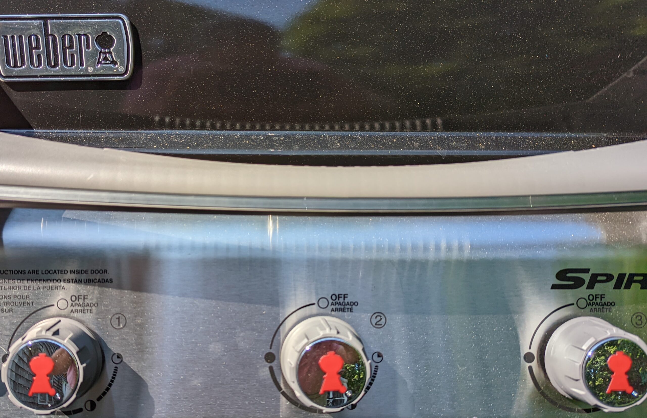
Are you having difficulty figuring out what that red silhouette is supposed to be? No, it’s not a Dalek. If you look up a bit, at the logo on the lid of the gas grill, you can place it. It’s the outline of the original grill that made Weber famous — the iconic, kettle-shaped charcoal grill.
But it’s a little weird to have an icon of a charcoal grill on your gas grill, wouldn’t you say?
Once you start looking, anachronicons are everywhere
Once icons started proliferating, a design philosophy called skeuomorphism became popular. A skeuomorph is a new object that remains ornamental design cues that were necessary in the original. In icon design, skeuomorophism shows up in icons that look like the objects that they replace — and eventually, the objects they have made obsolete. It’s as if the start button on your car included a picture of a buggy whip.
The classic example is the save icon on Microsoft products.

That second icon from the left is, of course, a floppy disk, which has been obsolete for 20 years.
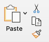
And when was the last time you did cut and paste with a scissors and glue bucket or jar of rubber cement?
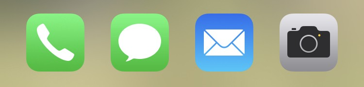
Our phones now include icons of the phones, letters, and cameras they replaced.
The logo for Zoom’s videoconferencing is a video camera. When was the last time you saw a video camera? Did it look like this?

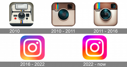
The evolution of the Instagram logo is an interesting case. It started looking like a Polaroid instant camera (which the Polaroid company stopped making in 2007). But eventually, the company replaced all elements of the Polaroid image, perhaps because it had gone from being retro to seeming dated.
Tivo, on the other hand, is still reminding us of when TV sets had rabbit ears — way back in the analog era, and already on their way to obsolescence when TiVo launched in 1999.
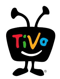
The logo has gotten a lot less cute, but it’s still got those obsolete rabbit ears.

Anachronicons persist because of nostalgia
Why do we do this? Why do we still make anachronicons?
I think it started because icons needed to refer to something familiar. But floppy disks and rabbit ears and Polaroid cameras are no longer familiar.
Rather than think hard about replacing them with something more representative of the digital era (what would a recognizable save icon or paste even icon look like?), I think modern designers want to remind you of your fuzzy feelings about the physical items you used in days gone by (or, if you’re young enough, that your old-timey analog ancestors used).
Sort of like what’s going on here.
I’d love to hear what you think. What objects that digital killed should be be memorializing as nostalgic anachronicons? And what anachronicons have you seen that perpetuate objects from days gone by — especially objects that they made obsolete?
I think I’ll bookmark this blog post, so I can return to it later.
Can’t tell if this was meant to be a joke or not…. either way, the bookmark icon is a good one! : )
Thinking on it a bit further, I’m guessing that yes, it was meant to be a joke. : )
Years ago, copy editor Bill Walsh wrote: “Icebox, tinfoil and other relics—Now that it’s the 1990s, we have aluminum foil and refrigerators. In speech, the Ralph Kramdenization of the language is merely annoying; in writing, it’s almost criminal. (Would you trust the reasoning of someone who thinks it’s 1953?)”
I love this. I’m reminded that remnants of old technology linger in our speech, such as our continued references to “dialing” telephone numbers. William Safire used to talk all the time about “retronyms,” noun and verb phrases created to distinguish original technology as newer technology takes over (“surface mail,” to distinguish from voice mail and email; “analog watch,” upon the invention of the digital watch (and, going even farther back: “pocket watch” instead of wrist watch); “acoustic guitar,” instead of electric guitar.
Does this mean you finally got your new grill from Lowe’s? 🙂
They failed to deliver on their second try, but on the third try, they finally delivered it!