All caps isn’t just ugly, but legally risky, too.
In Michigan, a group gathered enough signatures to put an abortion rights amendment on the ballot this November. Now an opposing group says the all-caps typography is so ugly that it’s unreadable, so the signatures should be tossed out.
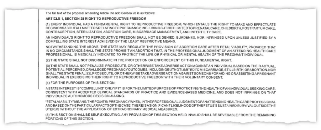
Here’s a portion of the petition in dispute:

That is, unquestionably, extremely difficult to read. The group challenging the petition said the petition included “nonexistent words” such as “decisionsaboutallmattersrelatingtopregnancy.”
Never use all caps in running text
The practice of using paragraphs of capitalized text is common in contracts where lawyers use it to make paragraphs stand out from the rest, ostensibly to make sure nobody could miss them. But a recent study showed that these paragraphs are in fact harder to read, especially for older readers.
The uniform height of the letters makes it hard to pick out individual words. Varying letter-height makes the normal mix of upper- and lowercase letters easier to parse. The starts and ends of sentences are far easier to pick out in normal mixed case writing where sentences begin with capital letters.
To be clear:
- Don’t use paragraphs of all caps text, they’re difficult to read.
- If you must use such paragraphs, don’t use fully justified text on both sides, because the result makes word spacing ugly.
- If, against all design logic, you decide to use fully justified all caps text, ensure adequate spacing between words.
This petition violated all three principles, and the result is a typographical abomination. (In a case judge decides to cite this blog post: yes, it’s still readable. No, I don’t think petition signers were unable to parse what they were reading. It’s just hideous.)
Here’s a meme to make sure you never forget.
The words “capital” and “uppercase” don’t appear at all in the New York Times article. That’s because the challenge to the referendum was based entirely on the missing spaces between words. It had nothing to do with the use of all-caps.
I’m fairly sure that missing spaces were not cause by the reliance on all caps, nor on flawed kerning or a faulty word-spacing algorithm. More likely, it was a technical glitch, or an editor or writer did a “search and replace,” thinking they had told Word to “replace 2 spaces with 1 space” but instead told Word to “replace 1 space with 0 space.”
That said, your reasons for avoiding all-caps are valid. All-caps writing impedes reading and impairs comprehension.
If I’m right, it’s typographical malpractice. If you’re right, it’s still . . . typographical malpractice.
Flawed Kerning is a great name for a band.